With its bold integration of architecture, structure, and environmental engineering, this solar-responsive, “breathing” building centers on sustainability and wellness.
Design informed by nature
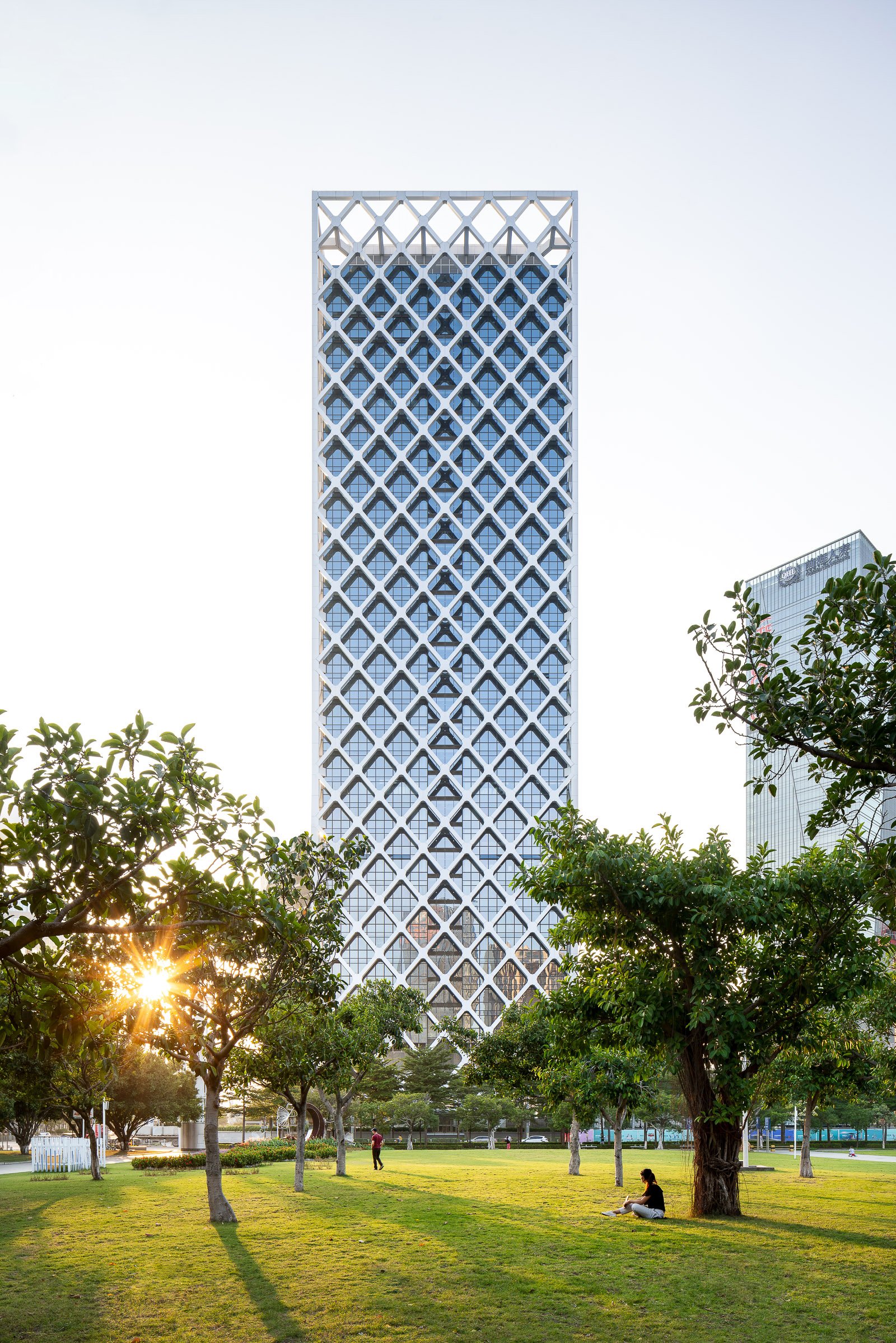
The headquarters for Shenzhen Rural Commercial Bank, a 158-meter-tall, 33-story tower located on the edge of a public park in one of Shenzhen’s key business districts, responds to the region’s tropical climate through a series of biophilic and sustainable design solutions.
The design inspiration is drawn from natural systems and elements like water and wind. These influences are evident in features such as the multistory water wall at the building’s main lobby, the undulating striations of marble cladding the tower’s elevator core, and the integration of a mixed-mode natural ventilation system that allows for seasonal air flushing of the key common areas and office levels. Automated louvers in the vertical atria traversing the full height of the tower and mechanized window vents on each office floor comprise a flexible system that allows the building to “breathe” during the frequent periods of pleasant weather experienced in Shenzhen.
High performance through integrated design
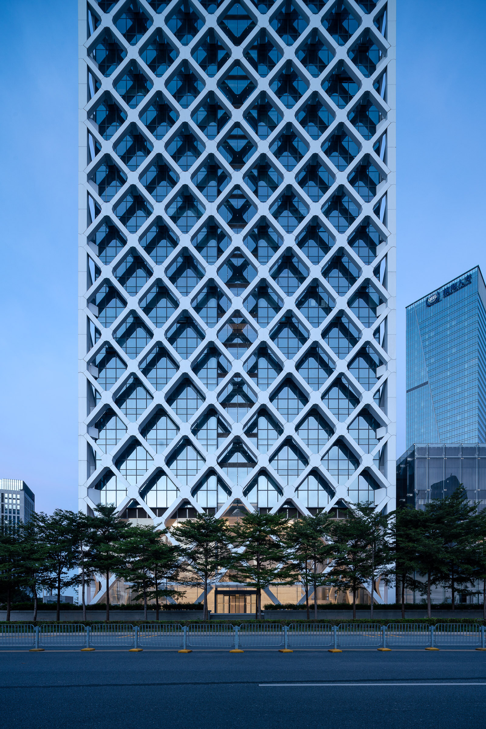
Building on SOM’s tradition of innovative structural engineering solutions, the design incorporates a tightly-spaced diagrid that serves two primary purposes. The first is to provide a solar shading system for the building and its occupants, an important consideration in mitigating the region’s hot tropical sun. Solar gain is thereby reduced by approximately 34 percent, and the design dramatically reduces glare in the office spaces within. The second purpose is to create an entirely column free floor plan and enable maximum flexibility of office layouts. The resulting interior space is defined only by a simple perimeter glass wall with an automated solar control blind to maintain optimal daylight levels.
A glass and bronze-toned private banking pavilion adjacent to the tower’s main lobby incorporates a high performance double-skin wall to provide environmental comfort and visual privacy to the consultation suites and areas for the display of artwork within. Reflecting pools, grey granite paving and seating areas, and arrays of trees and ground cover define the main entrance spaces and small gardens at the base of the tower, relating to the adjacent large public park that is the centerpiece of the district master plan.
SOM’s work on the Shenzhen Rural Commercial Bank Headquarters included architecture, mechanical, electrical and plumbing, structural and civil engineering. The tower is targeting LEED Platinum and China Green Star certification.
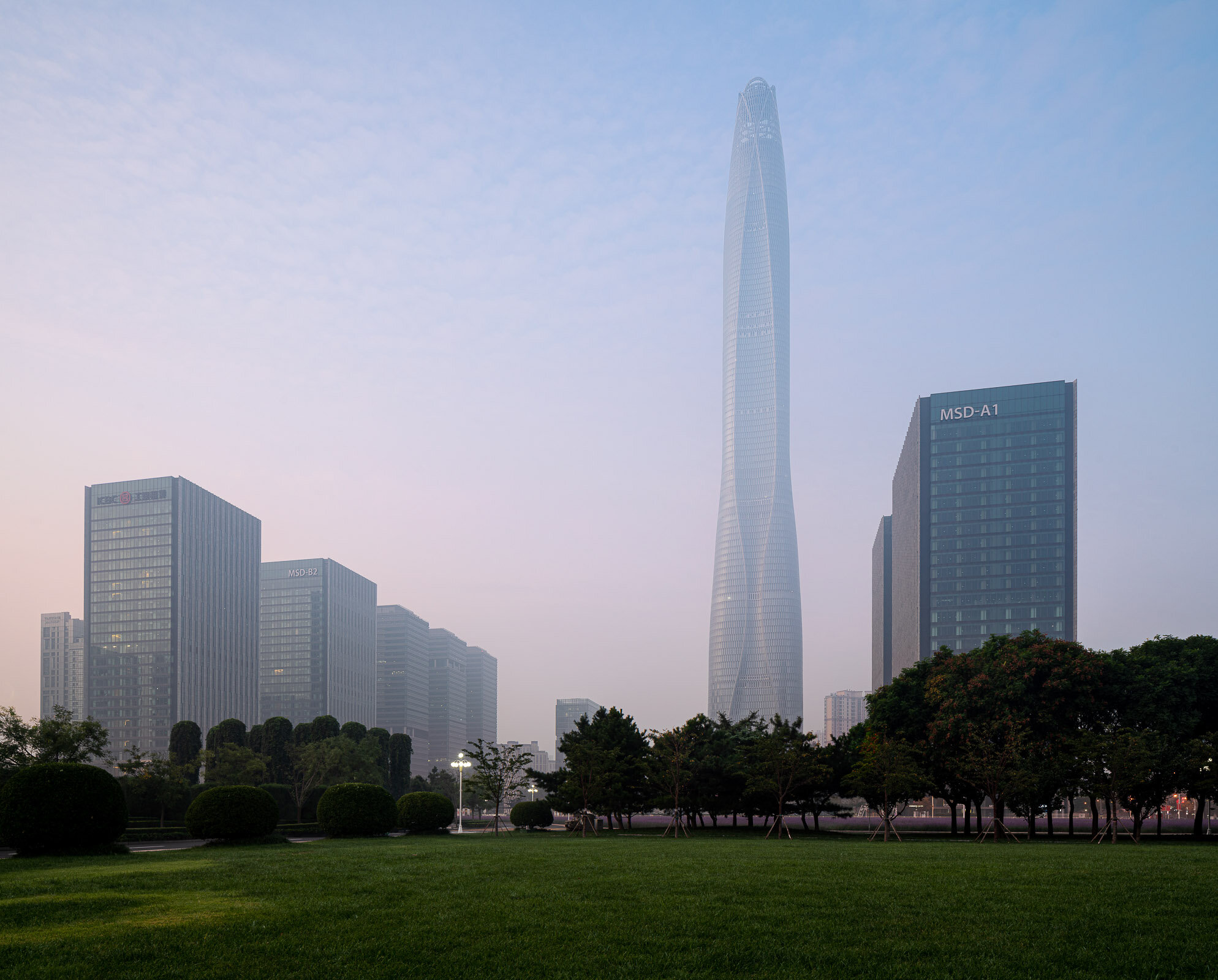
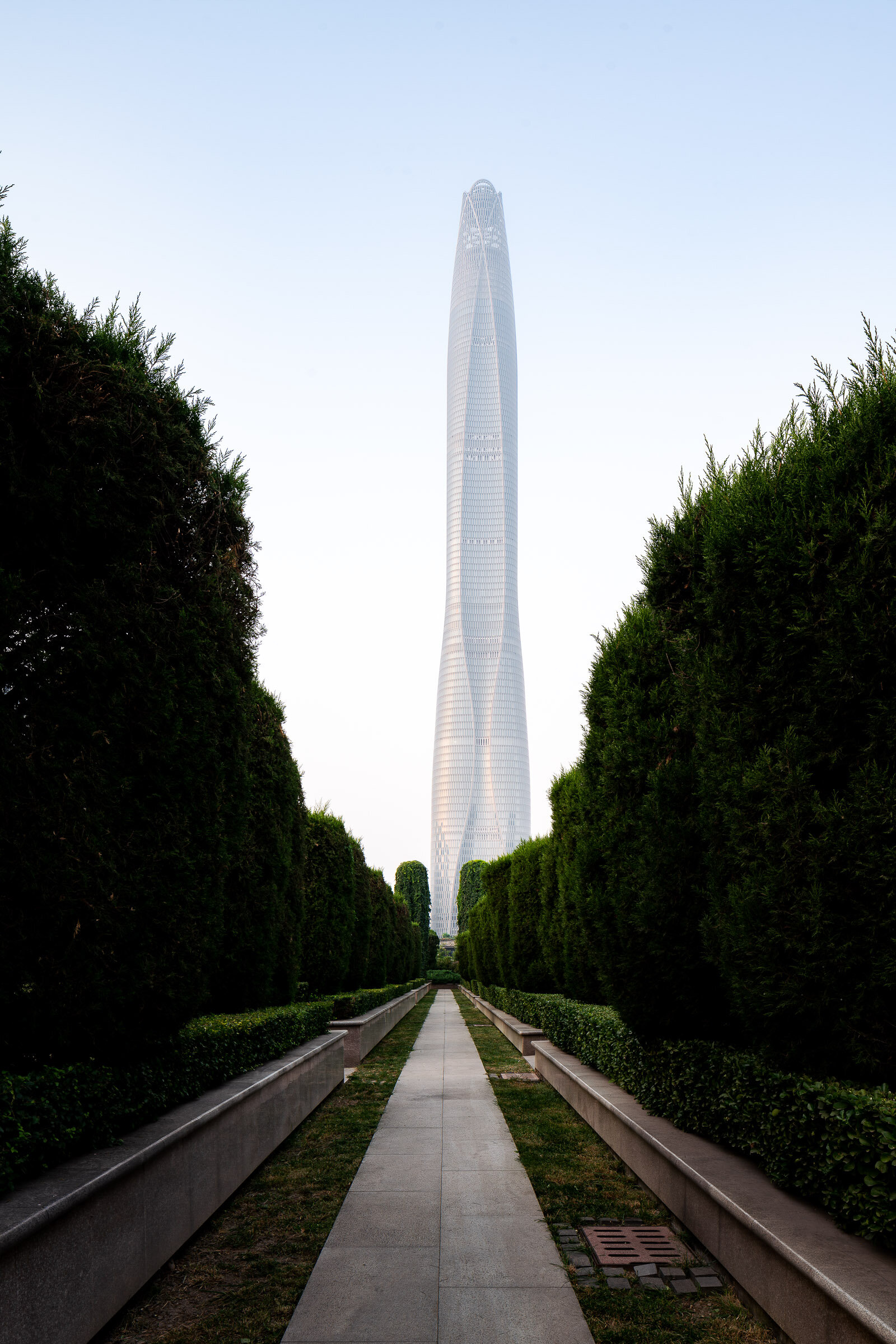
The Tianjin CTF Finance Centre is located in the Tianjin Economic-Technological Development Area, an outer district of Tianjin, China. The tower serves as an anchor for the larger area development, while housing office space, luxury serviced apartments, and a hotel.
By stacking reducing floor plates, the tower tapers dramatically to minimize the surface area exposed to wind, sun, and moisture. The gently undulating curves of the façade subtly denote the integration of the three distinct programs within a singular smooth object. Square in plan with rounded corners, the floor plate geometry enables unique interior fit-outs and customization options for occupants. Research by the architect has the shown that lateral forces due to vortex shedding can be controlled by tapering the vertical profile of the tower and softening any sharp corners in plan. The building’s aerodynamic shape greatly reduces this vortex shedding by “confusing the wind” and disrupting the opportunity for any resonating wind forces and loads on the structure.
The softly curving glass skin integrates eight sloping megacolumns that follow a lyrical line connecting the centers and corners of all four elevations. These curving megacolumns increase the structure’s response to seismic concerns and are integral to both the gravity and lateral systems. They are effective in increasing the stiffness of the building’s perimeter frame, consequently attracting a larger portion of the seismic forces in compliance with the Chinese code requirements.
The façade reinforces the curvature of the tower form and creates a shimmering texture over the building’s surface. The crystalline-like curtain wall stretches from the suspended glass canopies at each of the lobbies to the dematerialized, megacolumn-looped crown and presents a bold expression of a comprehensive, integrated design on the Tianjin skyline.
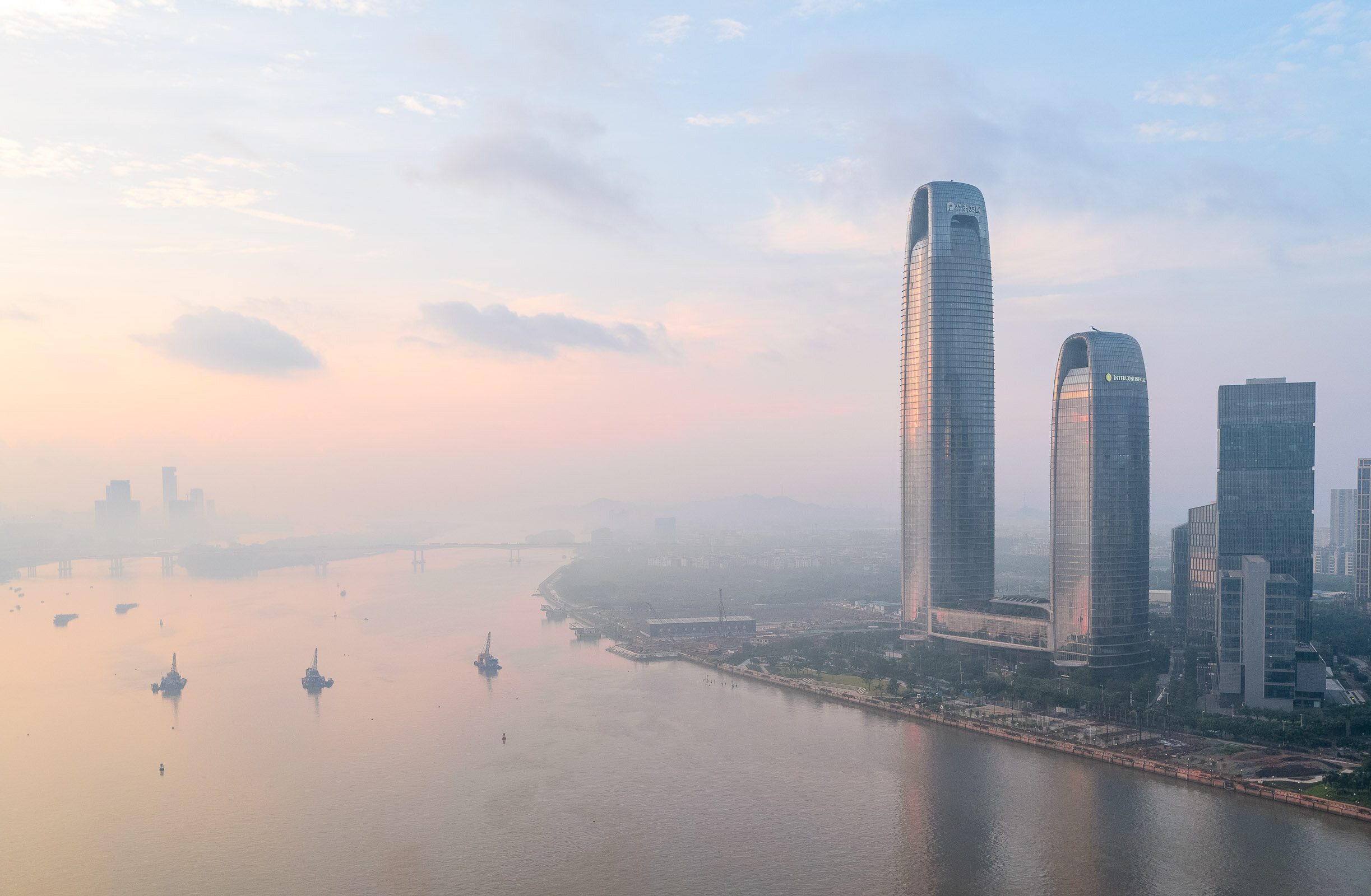
Pazhou Poly is a mixed-use office and hospitality complex in Guangzhou, designed by Skidmore, Owings and Merrill. It was named a winner in the Best Tall Building 300-399 Meters category of the 2020 Award of Excellence by The Council on Tall Buildings and Urban Habitat (CTBUH).
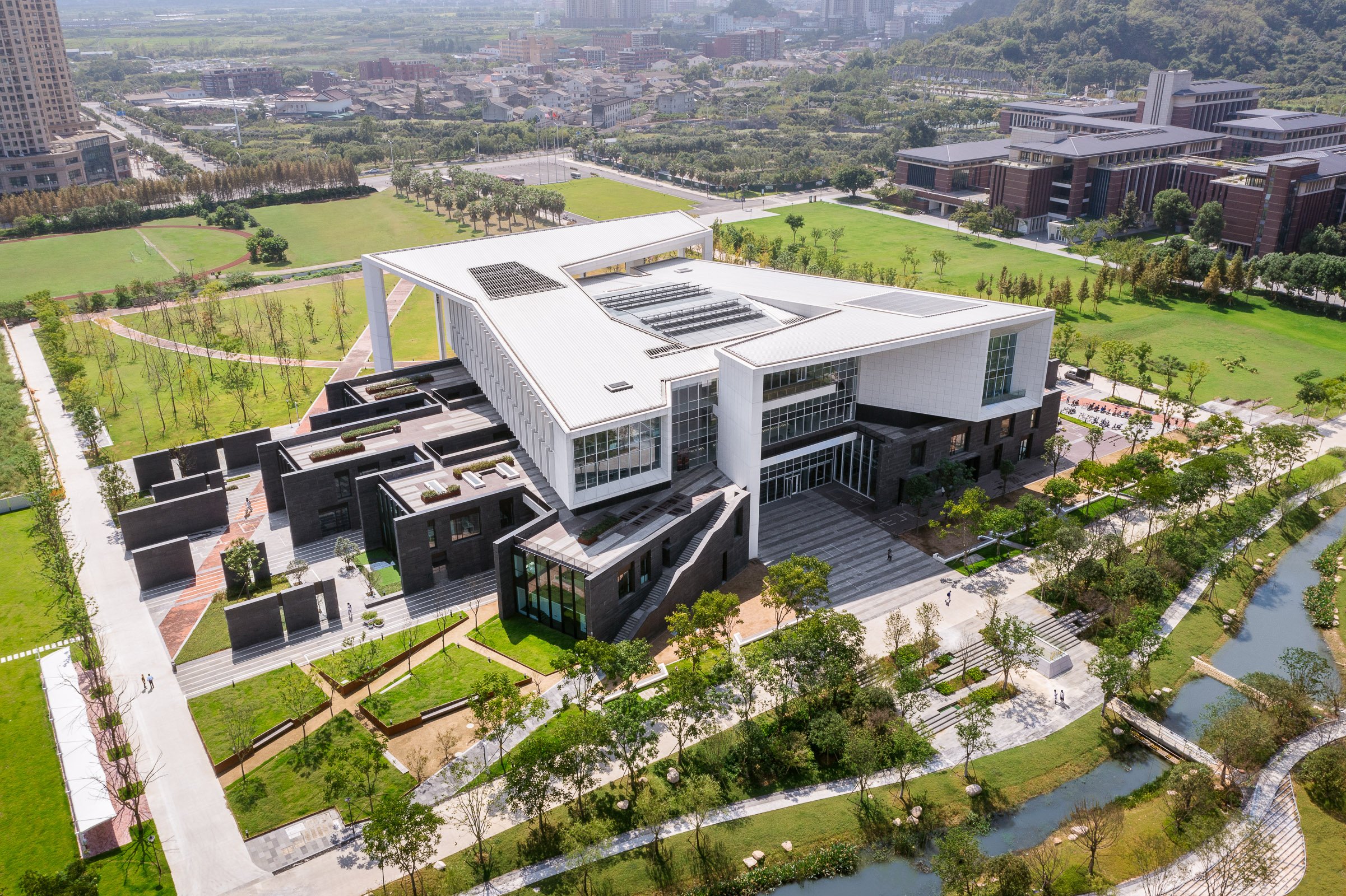
The Architecture and Design Academy at Wenzhou Kean University (WKU) holds the center of a fast-growing campus, following a master plan by Michael Graves Architecture and Design. As a Chinese institution whose curriculum is provided by Kean University in the United States, the Academy offers students degrees in Architecture, Industrial Design, and Computer Science that are recognized in both the United States and China.
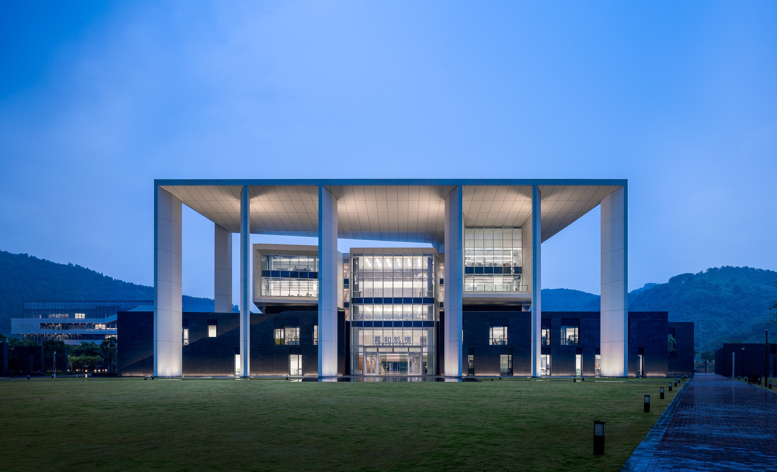
The design superimposes open plan design studios over a two-story base of flexible loft spaces that house class labs, library, maker spaces, and office suites. The base buildings form a pattern of lofts and alleys, clad in dark gray granite, contrasting with the white ultra-high-performance concrete of the upper structure. At the north and south, grand porches address major campus spaces, and frame entrances to the great central hall with its Piazza di Spagna-sized stadium seating- the largest shared venue for campus events.
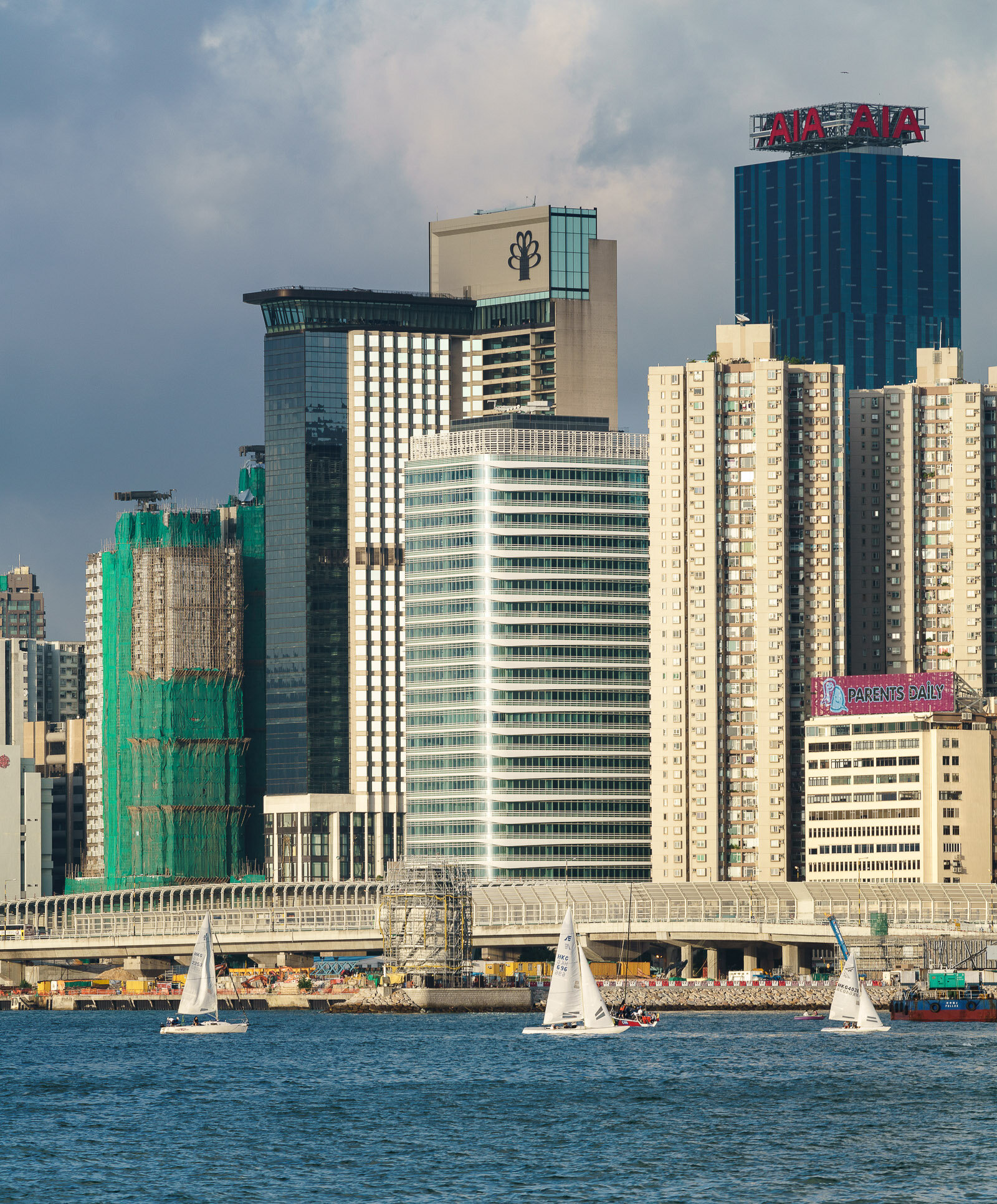
Located in North Point, the eastern district of Hong Kong Island, 18 King Wah Road is a new 23-story office building in Hong Kong and second commission for Pelli Clarke Pelli Architects. 18 King Wah Road commands a striking view of Victoria Harbor and Kowloon Bay, and to the west, PCPA’s iconic International Financial Centre marks the skyline.
In contrast to the density of its urban neighbors, the design of PCPA’s building is airy and buoyant. The triple-height Y-shaped columns that support the base of the tower deliver an exciting visual on the street, announcing the building’s presence. While solid in breadth, they seem to lift the base effortlessly. Metal fins wrap around the crisp glass and steel curtain wall, creating a lively pattern the full height of the building’s compact vertical massing. Each office floor will have spectacular views of the waterfront, Victoria Harbor and Kowloon Bay.
The project meets Gold Well Building Standards, Platinum Asia Regional Intelligent Green Building, and LEED Platinum. Key environmental concerns such as dense urban congestion and extreme afternoon temperatures are addressed. The curved corners of the building allow air to flow continuously throughout the tightly built-up neighborhood. High-performance metal sunshades wrap the exterior of each floor to minimize the effect of the intense solar rays from overheating the interior spaces. The shades are designed to function specifically to the sun’s orientation. On the north-west corner, they extend outwards and downward to mitigate the harsh afternoon sun. On the south-west corner, a second shade extends out to block the higher angled mid-day sun. Concurrently, this second feature acts as a light-shelf that directs daylight deeper into office interiors, significantly reducing the need for artificial lighting.
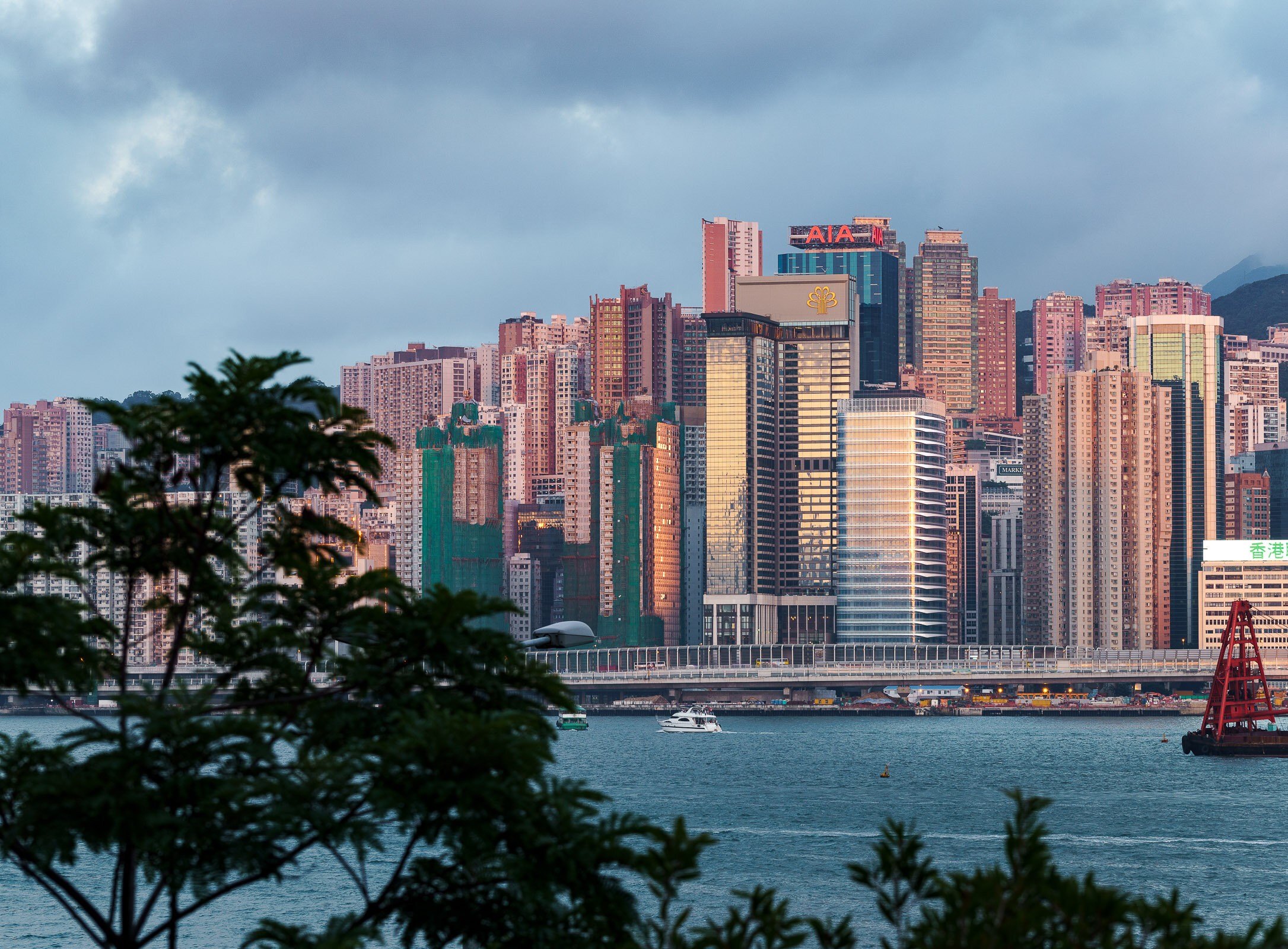
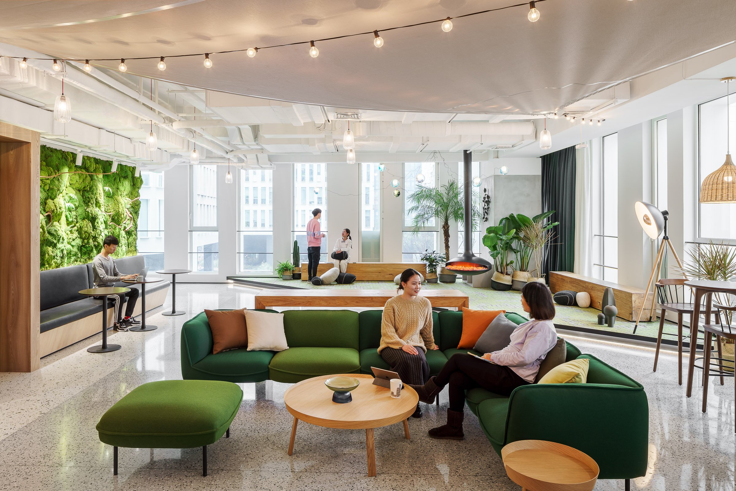
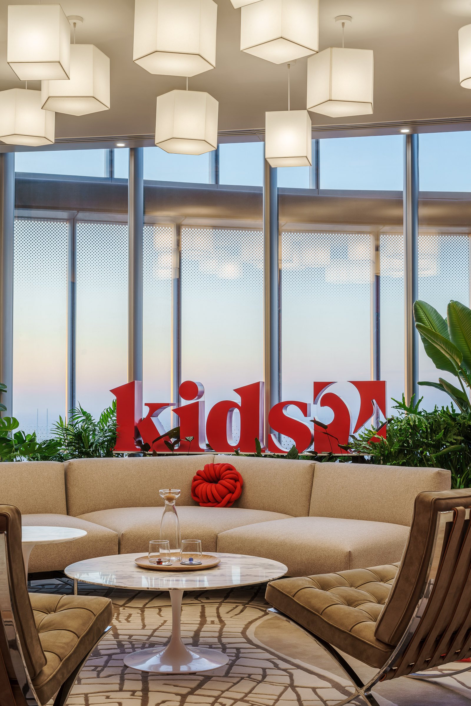
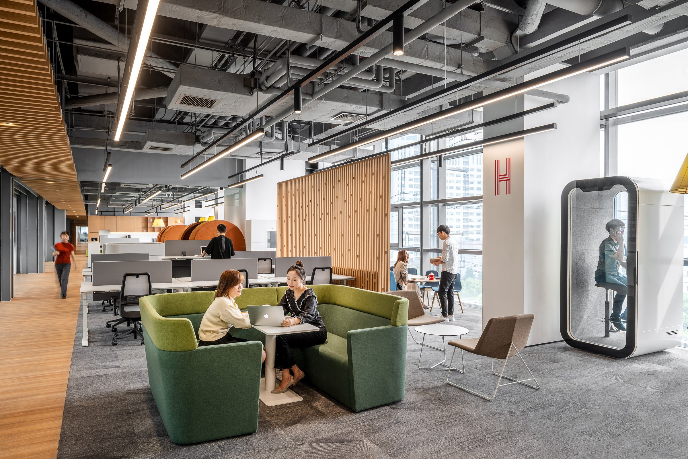
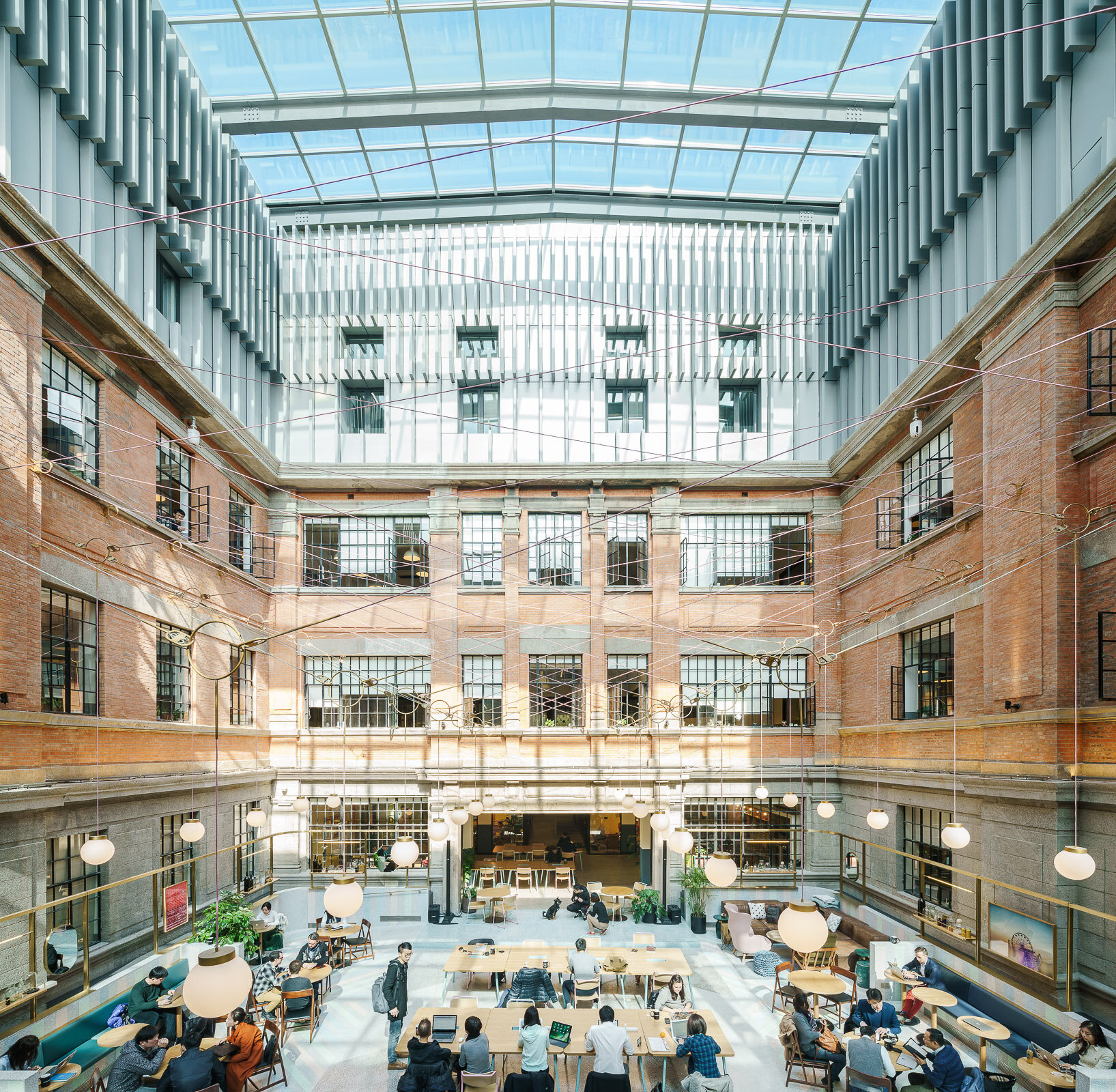
Headquartered in New-York with 50 office locations around the world, WeWork has now transformed Shanghai buildings into exciting shared workspaces. As the flagship location for China, WeWork Weihai Road resides in a historical building originally designed by British firm Spence Robinson & Partners in the 1930s. The designer took inspiration from "The Grand Budapest Hotel" and added pink, blue and green into the original structure, combining lively modern design into the historical architecture. The historic building has now transformed into a modern workspace, attracting aspiring entrepreneurs, designers and emerging businesses large and small.
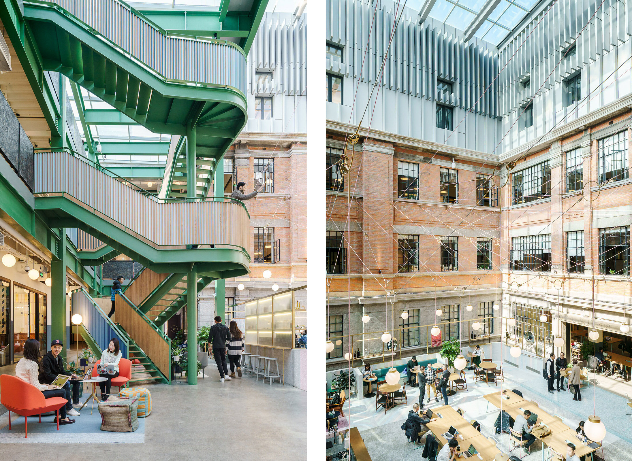
Headquartered in New-York with 50 office locations around the world, WeWork has now transformed Shanghai buildings into exciting shared workspaces. As the flagship location for China, WeWork Weihai Road resides in a historical building originally designed by British firm Spence Robinson & Partners in the 1930s. The designer took inspiration from "The Grand Budapest Hotel" and added pink, blue and green into the original structure, combining lively modern design into the historical architecture. The historic building has now transformed into a modern workspace, attracting aspiring entrepreneurs, designers and emerging businesses large and small.
Abbott Customer Experience Center (CEC) in Shanghai, designed by M Moser Associates, a global architecture and interior design firm who pioneered the integrated approach to deliver effective workplaces.
From M Moser:
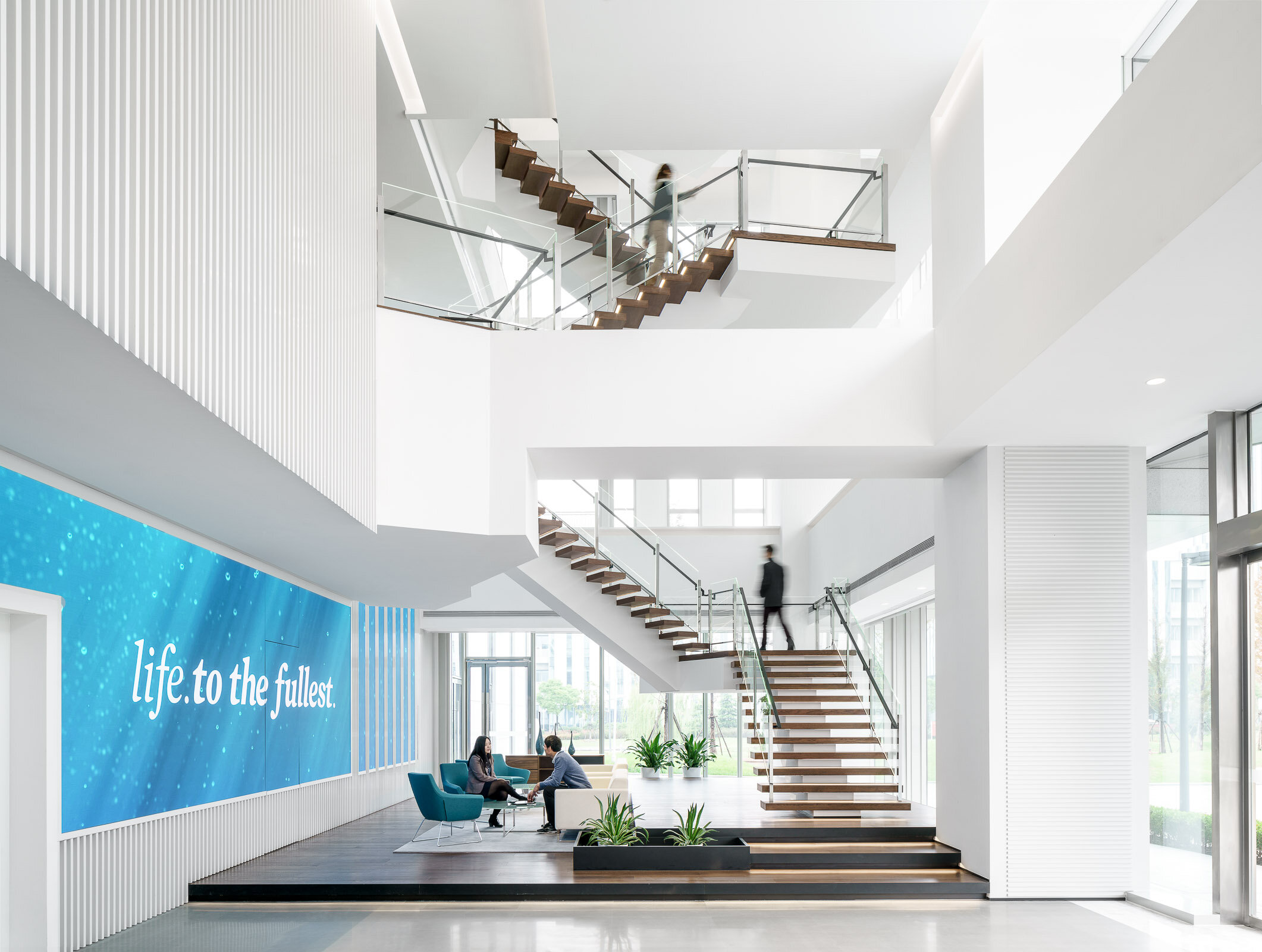
The Abbott Customer Experience Center (CEC) will foster a customer focused show-suite and training center with state-of-the-art interactive technology. In lieu of a traditional reception desk, the lobby welcomes visitors with a two-story modular digital LED tile wall, surrounding speakers, a hanging art-sculpture with customer-engaging audio-visual hardware, and a cantilevered continuous staircase the spans the entire vertical stretch of the building. We designed in a 50-person auditorium, executive business center, an exterior roof terrace, garden, staff workplace, call center, and fully functioning biosafety training labs.
Achieving a rating of LEED Silver, this facility represents the company’s commitment to sustainability, wellness, and a human-centered purpose to healthcare science.
Founded on the belief that all design should deliver a human connection with space, we begin our process with a deep-dive exploration of what emotional reactions would align with core business objectives. If the desired effect is comfort, excitement, playful, cheerful, confidence, boldness, intimacy, or even an uncomfortable awkwardness, this informs specific properties of scale, materiality, colors, spatial adjacencies, lighting and furniture selections.
The Abbott CEC is designed with the human experience in mind first — driving the technology integration, user interface, materials, and the interior architecture.
During the 6-month design period, a carefully constructed customer journey was mapped out through working intimately with Abbott and consultants to gain a deep understanding of their business. The journey outlined the experiences and interface for the users (customers) at each “touch point”. This then informed the architectural design of the space.
The 6 x 8 x 2.4h meter “Möbius strip” or “Infinite Ribbon” sculpture was created as an iconic arrival point for customers in the lobby, to inspire curiosity and push information about Abbott. The structure is completely hung from the ceiling and cantilevered from the core wall. Guests can walk inside and thru motion sensors, the LED display screens and background audio immediately come alive. Videos are played on screens on both sides. Gesture-based menu interaction is also available for a more customized experience.
The stair is at the heart of connectivity between floor functions and the vertical journey experience. Guests walk up the stair with an obscure view up thru “floating” landings to the fourth floor. New slab openings, structural bracing, and each stair run and landing is fully cantilevered from the building core, with only 1 larger support at the base. The first 3 steps of the stair were created as landings to hide this support.
The Customer Experience Center begins on the second floor. The “Hall of Challenges” disrupts guests perception of space through a long corridor with light in motion, reflection, intense sound effects, and digital images on screen beyond. This experience was designed to disconnect customers from their previous surroundings and into a fully immersive new space which begged for their attention.
The other rooms of the Experience Center include a curved floor-to-ceiling rear projection screen, dramatic surround sound, 48-point ‘Multitaction’ touch screen, ceiling light effects, a virtual environment with rear projection on all four walls of the room (where any environment could be presented), product demo area, and an interactive customer solution room.
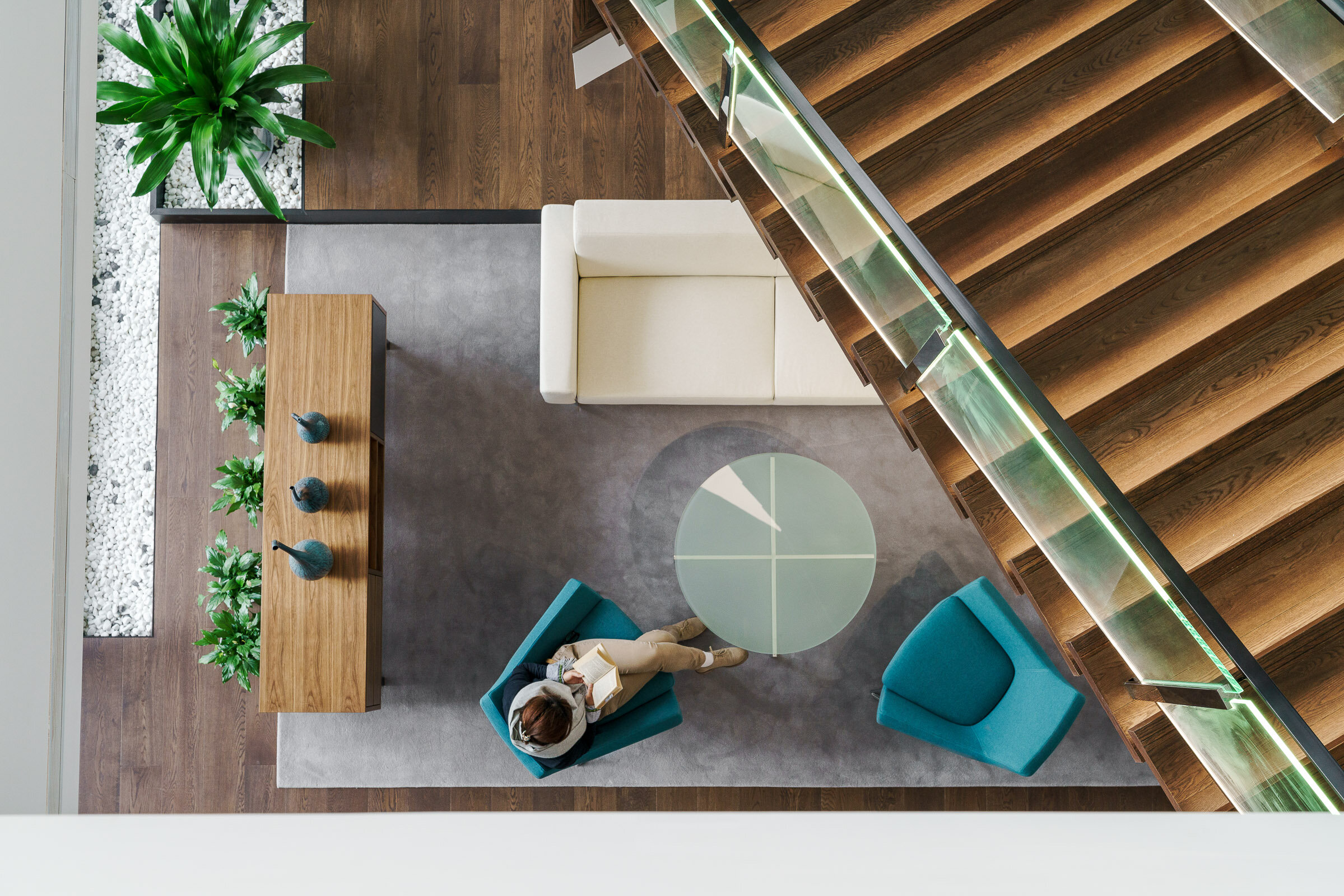
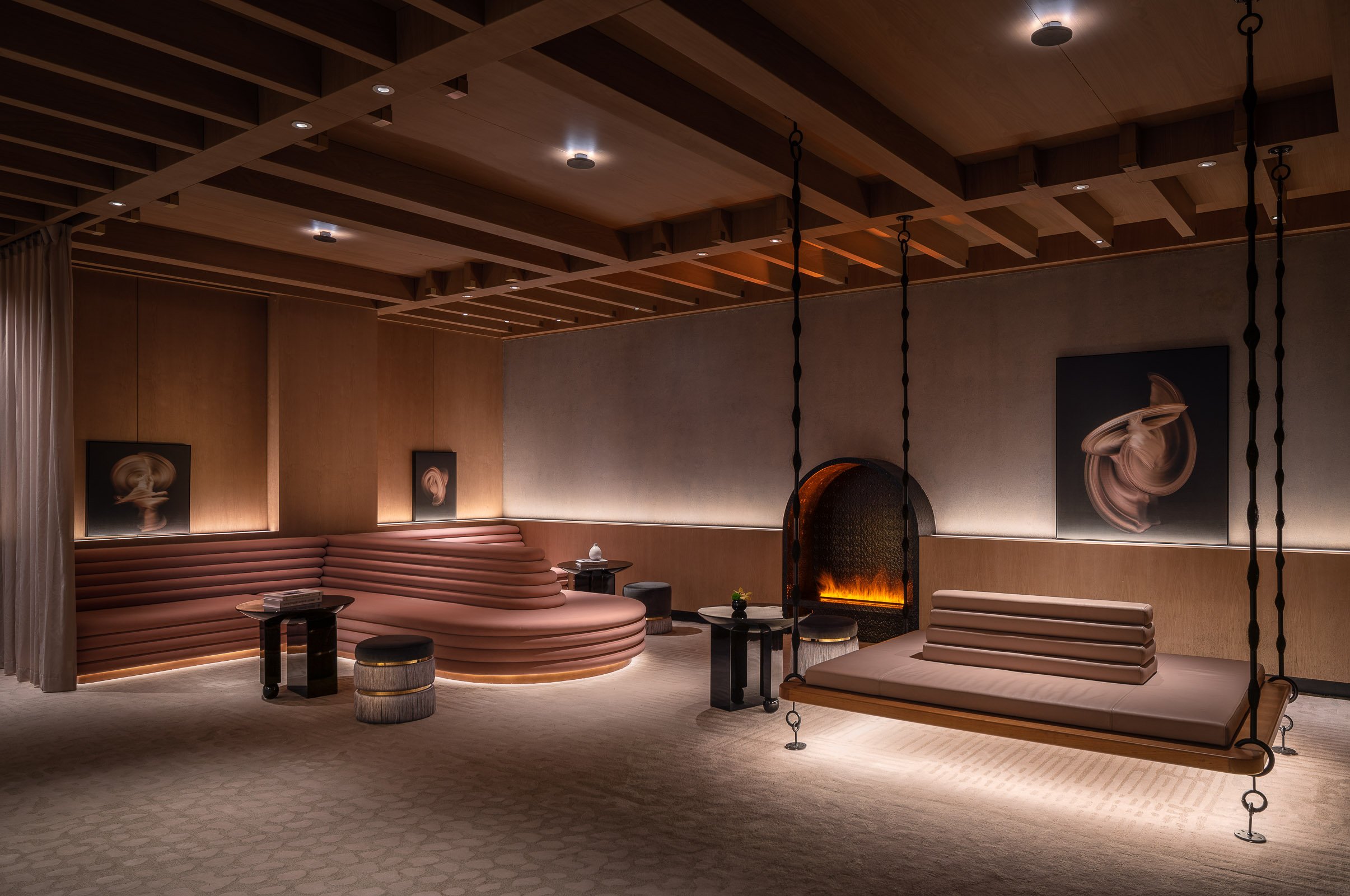
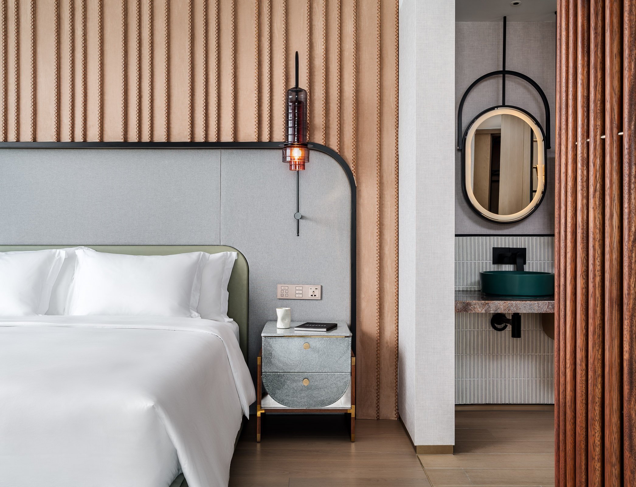
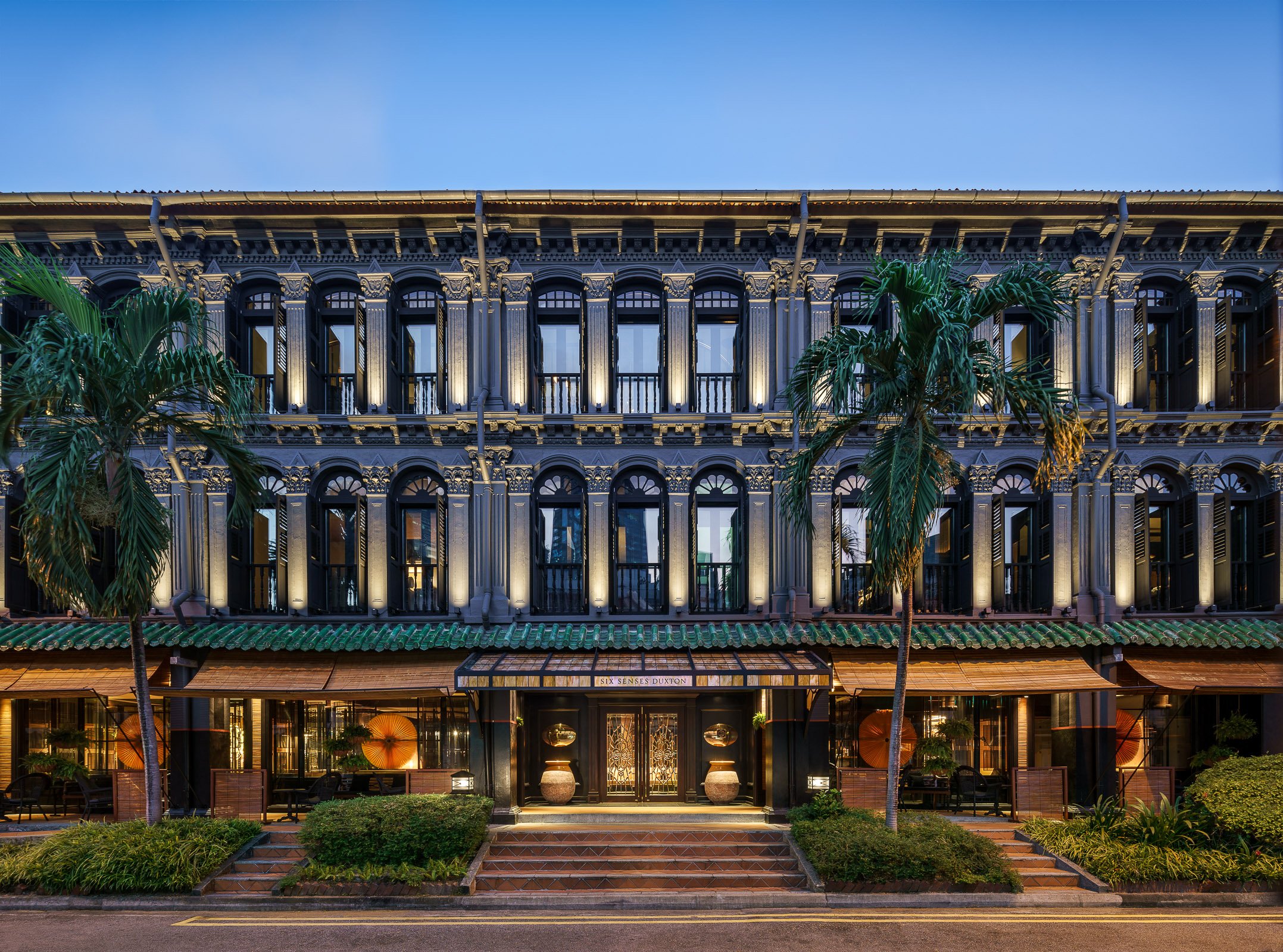
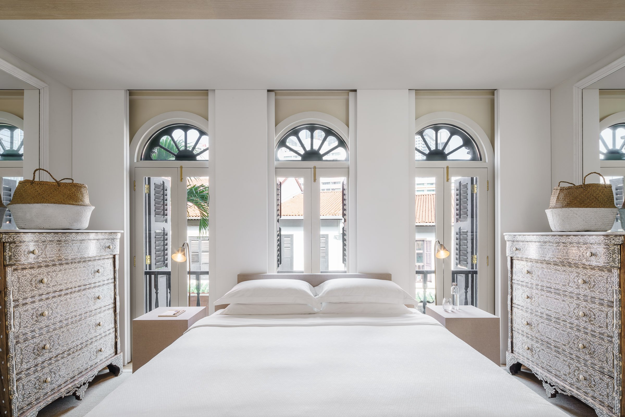
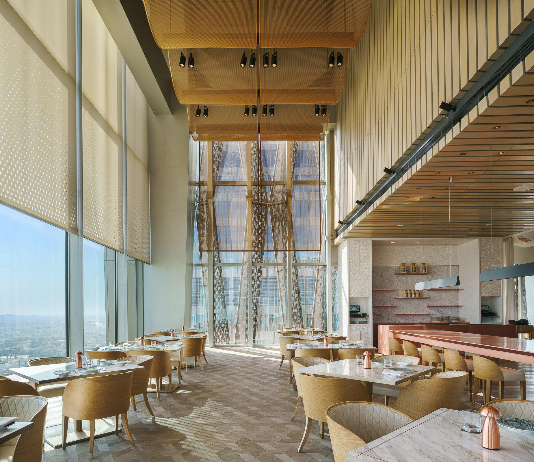
Kokaistudios' newest projects with Four Seasons Hotels & Resorts - the Dai Forni Italian located in the newly built Four Seasons Kuwait in the Burj Alshaya building.
Having previously worked together on the Brasserie at the Four Seasons Kyoto the Four Seasons team invited Kokaistudios to conceive an elegant F&B destination bringing the freshness and tastes of Italy to Kuwait.
The starting point of the design process was to canvas Italy and determine which part of its vast culinary heritage and geography to focus on and the designers quickly settled upon the tastes, smells and textures of the Mediterranean and in particular the island of Sicily; long the meeting point between the cultures of the Middle East and Europe. Dai Forni is part of the emerging global cultural culinary trend of regional rather than national cuisines; and the restaurant design and cuisine are a testament to this trend.
Kokaistudios envisioned the space as an oasis for all of the senses with the entrance characterized by an immense green wall; itself an innovative structure filled with local desert plant varietals; and large fire pillars that frame the entrance experience and bring the guests along a sandstone floored corridor into main dining areas centered by an expansive antipasti counter covered in a pink hued hand treated cooper from Italy.
To the left of the entrance corridor sits the front dining area featuring a stunning 12 meter high space with expansive views onto the city and the Persian Gulf beyond. The designers have enrobed the space in a custom designed metal mesh curtain illuminated by a diffused lighting system that creates a soft shimmering glow. The intense sunlight and temperatures during the day-time drove the creation of an elaborate system of laser cut curtains that help to maintain a cool and welcoming temperature.
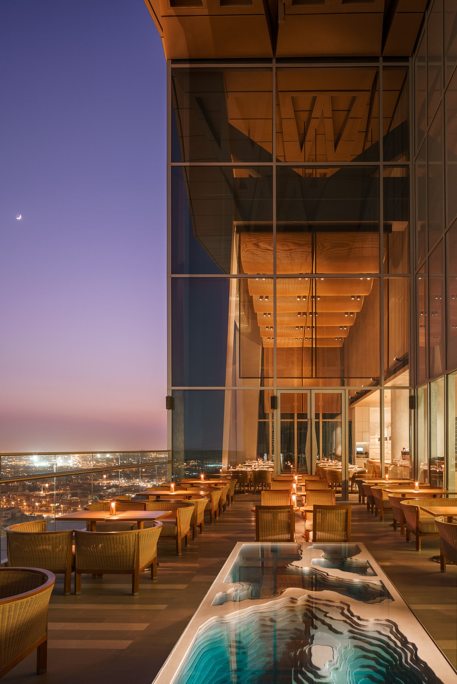
Kokaistudios' newest projects with Four Seasons Hotels & Resorts - the Sintoho Asian fine dining restaurant located on the top floor of the newly built Four Seasons Kuwait in the Burj Alshaya building.
Having previously worked together on the Brasserie at the Four Seasons Kyoto the Four Seasons team invited Kokaistudios to conceive an innovative F&B destination that could elevate the street foods of the cities of Singapore, Tokyo and Hong Kong into a fine dining destination and experience.
Intrigued by the concept and the location in a city with no established tradition of Asian fine dining we set about creating a temple to Asian cuisine and craftsmanship that eschewed kitschy and thematic styles and aimed for the creation of an essential and refreshing space in which the dining experience is influenced both by the architecture of the space and the food offering.
The restaurant design was conceived first and foremost around the idea of celebrating the diversity and excellence of Asian cuisine and creating spaces and opportunities for the guests to experience the sights, smells and tastes of these food cultures up close.
We searched for commonalities between the cultures in order to come up with a design language to unite them and we took our inspiration less from the current nature of the individual countries but rather from the historical role that Chinese culture has played over time throughout Asia and how those influences continue to be part of everyday life.
The entrance area of the restaurant features a long corridor flanked on one side by an expansive green wall filled primarily with local desert plant varietals and on the other by a series of custom designed water towers which combine to create a cooling and soothing experience. The corridor finishes in a tea wall fronted by an elaborate carved wood tea station where guests can select an expansive choice of fine teas.
To the right of the entrance corridor sits the main open dining area on the right that features expansive 12 meter high ceilings that offers expansive views of the city and the Persian Gulf beyond. The front dining area center features a series of custom designed furniture for which we cooperated with Kyoto based artisans and the area is hemmed by an extensive shousugi ban burnt wood sushi counter inlaid with hand hammered brass. The soft lighting in the area comes from the series of water drop glass pendants produced by the London based artisans DHLiberty Lux.
The rest of the public area seating is centered largely around the individual open live cooking stations where guests can experience up-close the preparation of robatta, teppanyaki, and dim sum and other delicacies from Hong Kong which have been clad by hand-hammered metal hoods and sculpted stone bases featuring images and motifs typical inspired by classical designs found in China.
The strong inter-play between the main materials of wood, stone, and hand-finished metals is thrown a curve by the insertion of a 3D feature wall made of exposed concrete forms that runs the length of the kitchen wall and has been designed using parametric principles and its undulating form appears as a dynamic wave while being in actuality a straight structure.
The private dining rooms are an ode to Chinese embroidery craftsmanship with bespoke chairs and walls featuring hand-printed linen fabric albeit with a wink to principal designer Filippo Gabbiani’s home town of Venice via the use of the Fortuny silk pendant lamps and red Murano glass inlays.
The bathrooms are an experience in and of themselves as we cooperated with a Shanghai based video production team Flatmind to create a series of Chinese shadow video installations that are projected on the grey hand hammered Chinese stone.
The outdoor seating areas that are shared with the neighboring Italian restaurant Dai Forni; also designed by Kokaistudios; feature a stunning glass sculpture from London based artisans Duffy.
The design of this project is a new step in Kokaistudios method of combining a strong architectural approach to the design of interiors with an original use of materials and light to create unexpected subtle emphatic feeling between the space and the people; handcrafted materials shaped and controlled up to the finest detail interact and interplay with the both the day and night light and reveal an incredibly expressive power.
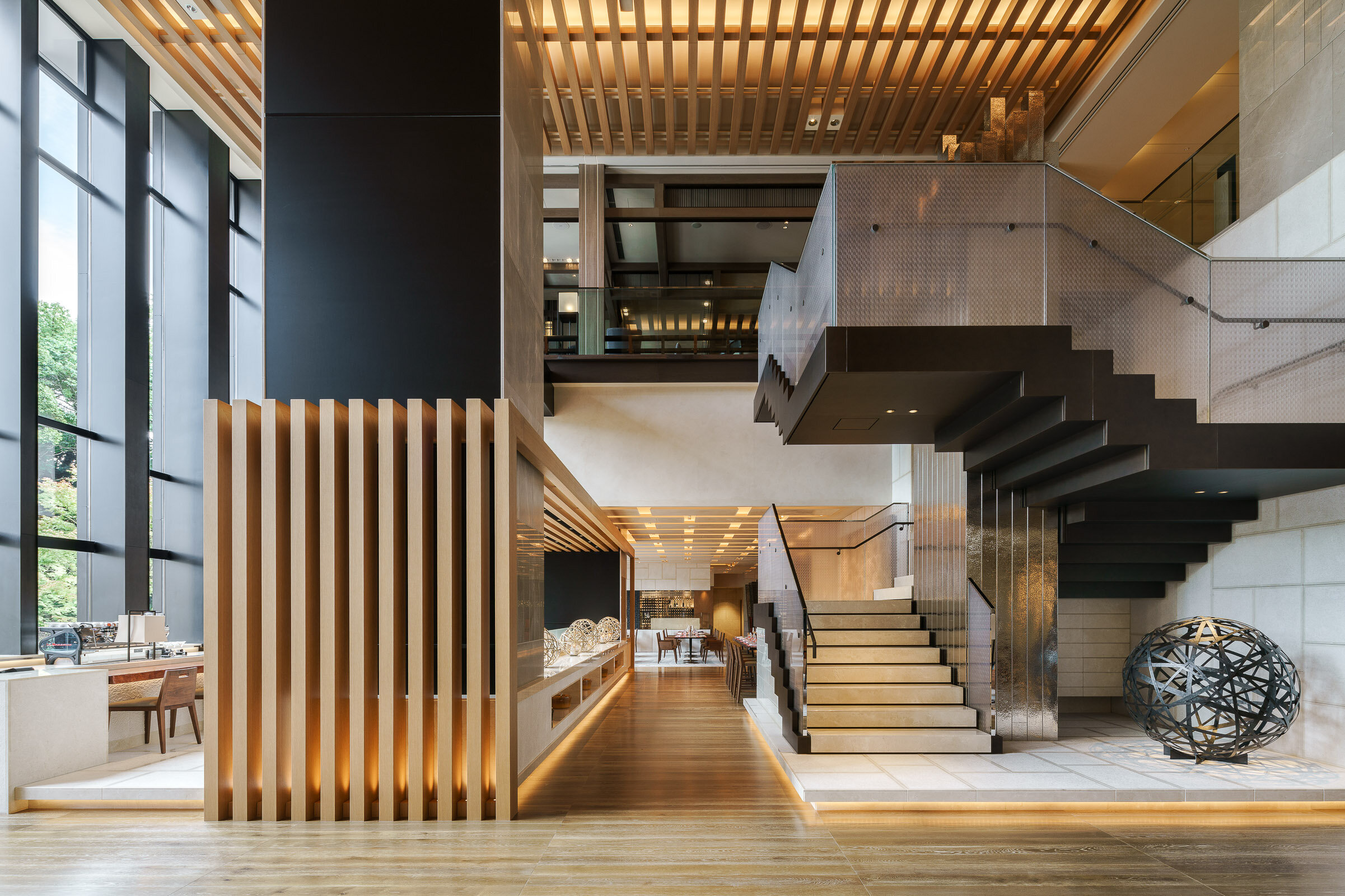
Brasserie Restaurant & Lounge at Four Seasons Hotel Kyoto, designed by Kokaistudios.
The new Four Seasons hotel is located in the UNESCO protected area of the temples of Kyoto at the base of the mountains and faces a historical traditional Japanese pond surrounded by a magnificent heritage ikeniwa. Positioned between the arrival lobby and the garden, the restaurant is the core of the public space of the hotel. The architect conceived the space on with a strong architectural strategy by using the Kyoto traditional system to connect indoor to outdoor, creating a large architectural feature that frames the view of the garden.
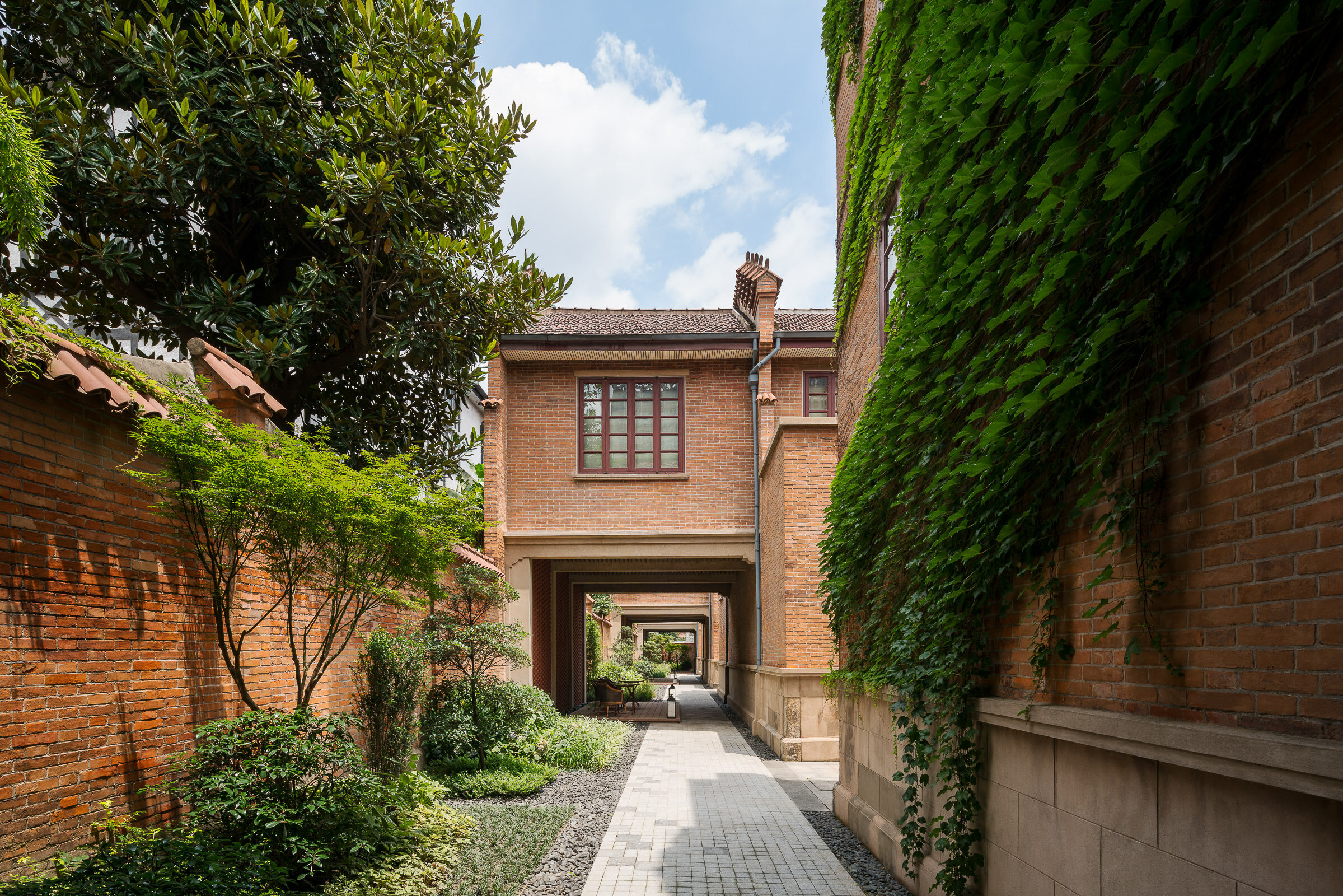
Originally built in the 1930s by French real estate company Foncière et Immobilière de Chine, the Jian Ye Li “shikumen” complex; located in the heart of the former French concession had evolved and been altered over the years but was essentially intact in its historical configuration and represented an incredible development opportunity.
Originally these “shikumen” buildings were designed for middle class families in Shanghai and as they lacked modern plumbing facilities they were often seen as products with little value to preserve and were either demolished or just the “shell” was maintained and they were converted it into commercial use.
After extensive research and study, Kokaistudios developed an architectural renovation strategy that maintained the architectural features of the “shikumen” lane houses while tastefully altering the internal layout and transforming them into spaces suitable for modern luxurious living where each original lane house unit was transformed into one luxurious guest suite.
Practicality is not a term that applies to this project as the shikumen architectural typology; characterized by their narrow and tall nature meaning that the minimum 110 sq.m suites are split over 2 floors via a step staircase with no elevator; does not lend itself naturally to conversion to hospitality use. However when the ultra-luxury Capella hotel brand entered into the project several years later minimal upgrades to the architecture of the buildings were required to meet their exacting standards and they created 55 luxury suites each occupying one of the lane-houses.
Today the hotel occupies a unique position within Shanghai’s luxury hotel landscape and offer their guests a truly unique hospitality experience not available anywhere else in the world.
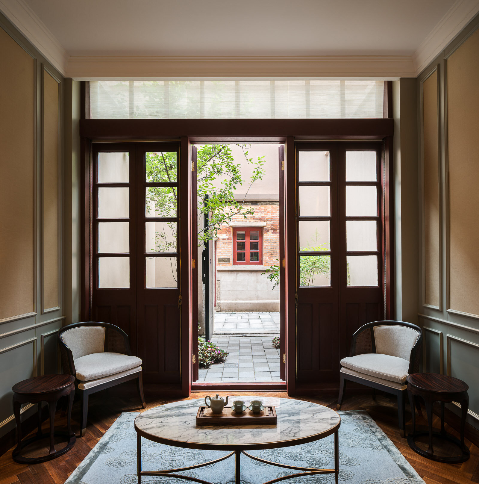
Originally built in the 1930s by French real estate company Foncière et Immobilière de Chine, the Jian Ye Li “shikumen” complex; located in the heart of the former French concession had evolved and been altered over the years but was essentially intact in its historical configuration and represented an incredible development opportunity.
Originally these “shikumen” buildings were designed for middle class families in Shanghai and as they lacked modern plumbing facilities they were often seen as products with little value to preserve and were either demolished or just the “shell” was maintained and they were converted it into commercial use. After extensive research and study, Kokaistudios developed an architectural renovation strategy that maintained the architectural features of the “shikumen” lane houses while tastefully altering the internal layout and transforming them into spaces suitable for modern luxurious living where each original lane house unit was transformed into one luxurious guest suite.
Practicality is not a term that applies to this project as the shikumen architectural typology; characterized by their narrow and tall nature meaning that the minimum 110 sq.m suites are split over 2 floors via a step staircase with no elevator; does not lend itself naturally to conversion to hospitality use. However when the ultra-luxury Capella hotel brand entered into the project several years later minimal upgrades to the architecture of the buildings were required to meet their exacting standards and they created 55 luxury suites each occupying one of the lane-houses.
Today the hotel occupies a unique position within Shanghai’s luxury hotel landscape and offer their guests a truly unique hospitality experience not available anywhere else in the world.
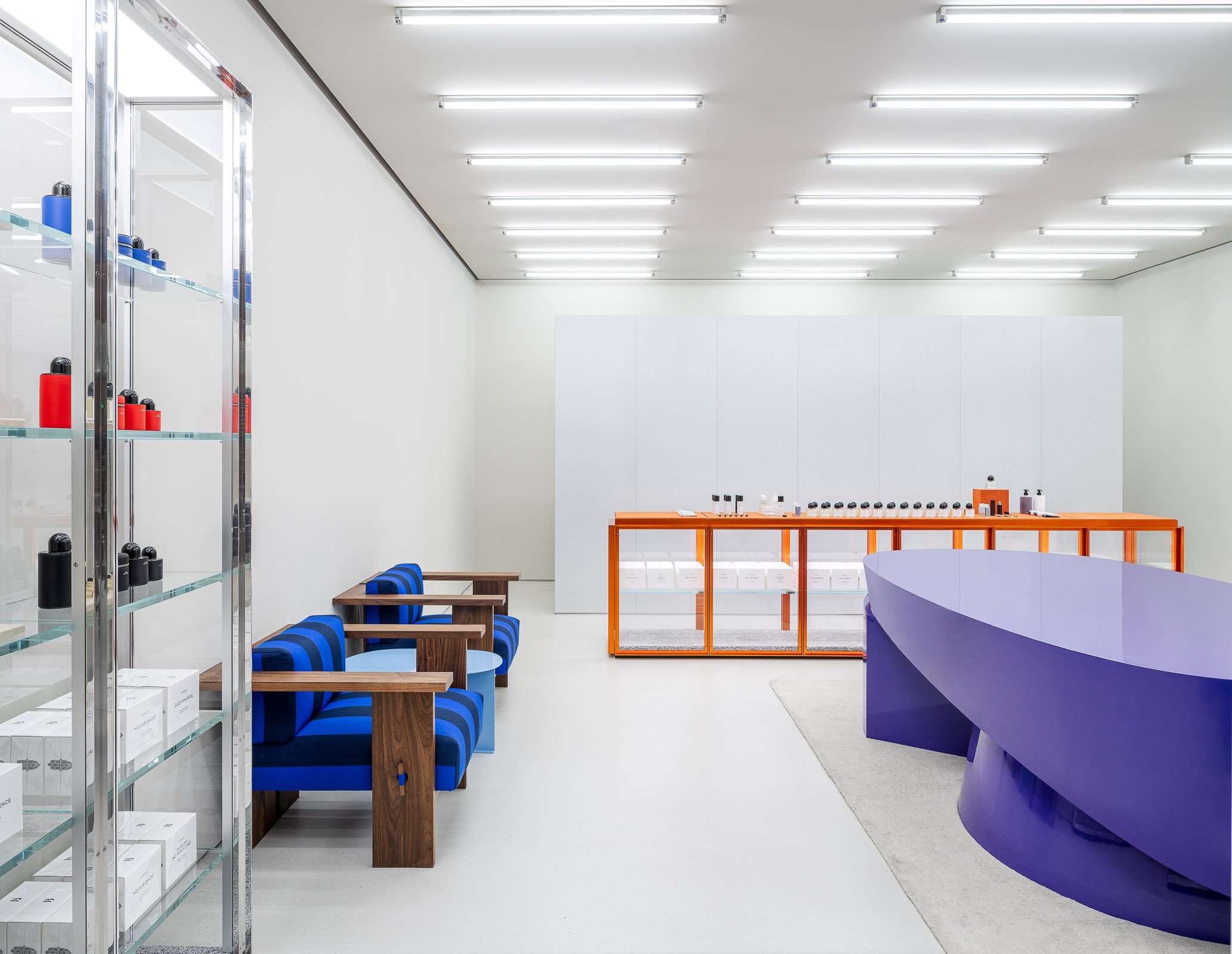
The new store is part of a series of openings across China, and is indicative of the city’s rise as a shopping destination, and one as forward in offerings as fellow first-tier cities Shanghai, Beijing and Guangzhou. Situated at The MixC shopping mall in the city’s Nanshan district, the store occupies a compact unit featuring an interior design by Stockholm-based architect and longtime collaborator Christian Halleröd. A hydraulic crane trolley lifting a colourful light box signals the store’s presence. Walls, flooring and ceiling in a soft grey hue form the backdrop for an assortment of furnishings, including large glass and steel cabinets, similar low cabinets with an orange frame, chunky wooden sofas with blue-striped upholstery, and a large oval table dipped in a striking purple hue. One side of the store is lined with large mirrors and pink stools. Lighting is highly functional, and sees three rows of tubular lights across the ceiling. The new Byredo store carries the brand’s full range of perfumes, home fragrances and hand & body care products.
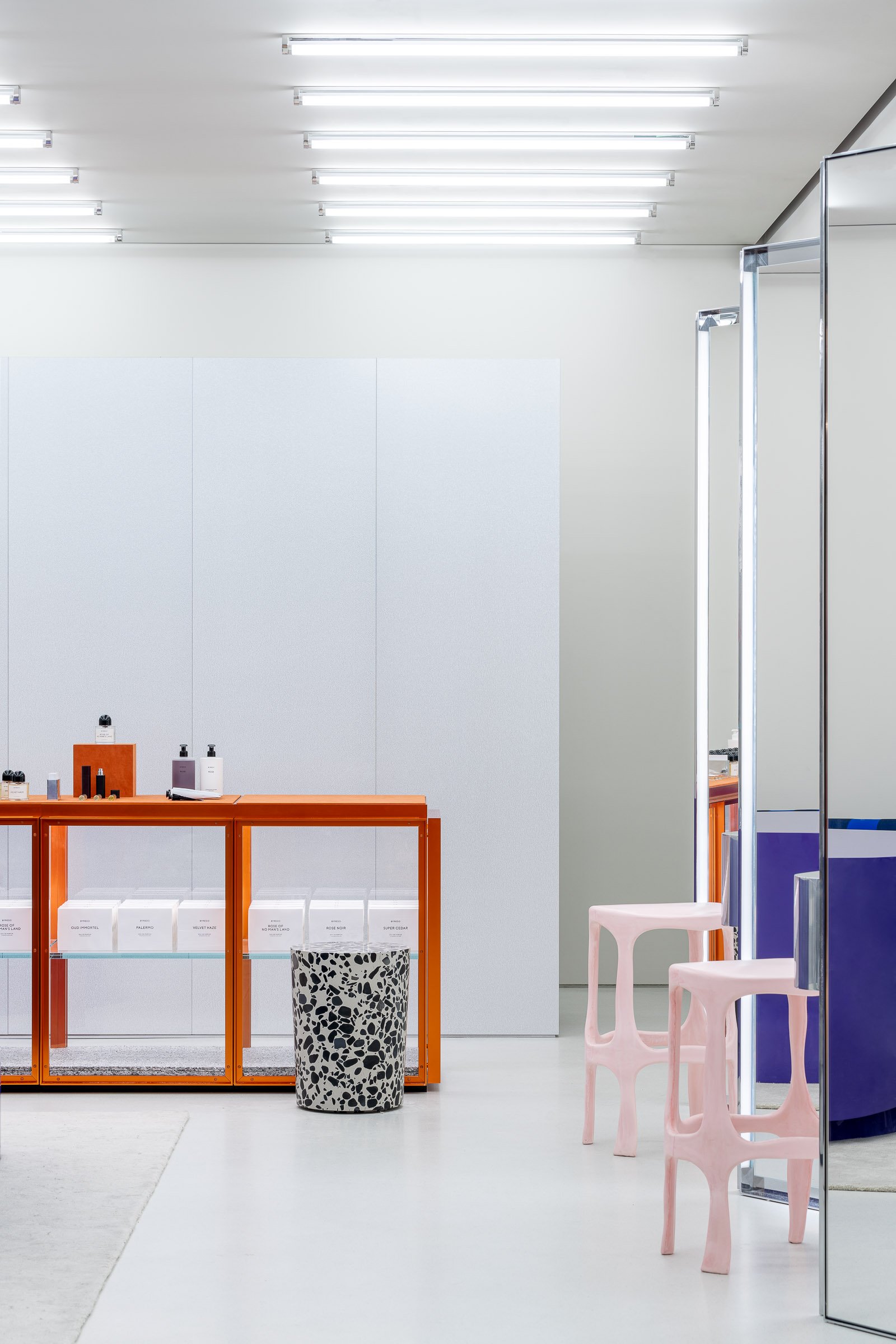
The new store is part of a series of openings across China, and is indicative of the city’s rise as a shopping destination, and one as forward in offerings as fellow first-tier cities Shanghai, Beijing and Guangzhou. Situated at The MixC shopping mall in the city’s Nanshan district, the store occupies a compact unit featuring an interior design by Stockholm-based architect and longtime collaborator Christian Halleröd. A hydraulic crane trolley lifting a colourful light box signals the store’s presence. Walls, flooring and ceiling in a soft grey hue form the backdrop for an assortment of furnishings, including large glass and steel cabinets, similar low cabinets with an orange frame, chunky wooden sofas with blue-striped upholstery, and a large oval table dipped in a striking purple hue. One side of the store is lined with large mirrors and pink stools. Lighting is highly functional, and sees three rows of tubular lights across the ceiling. The new Byredo store carries the brand’s full range of perfumes, home fragrances and hand & body care products.
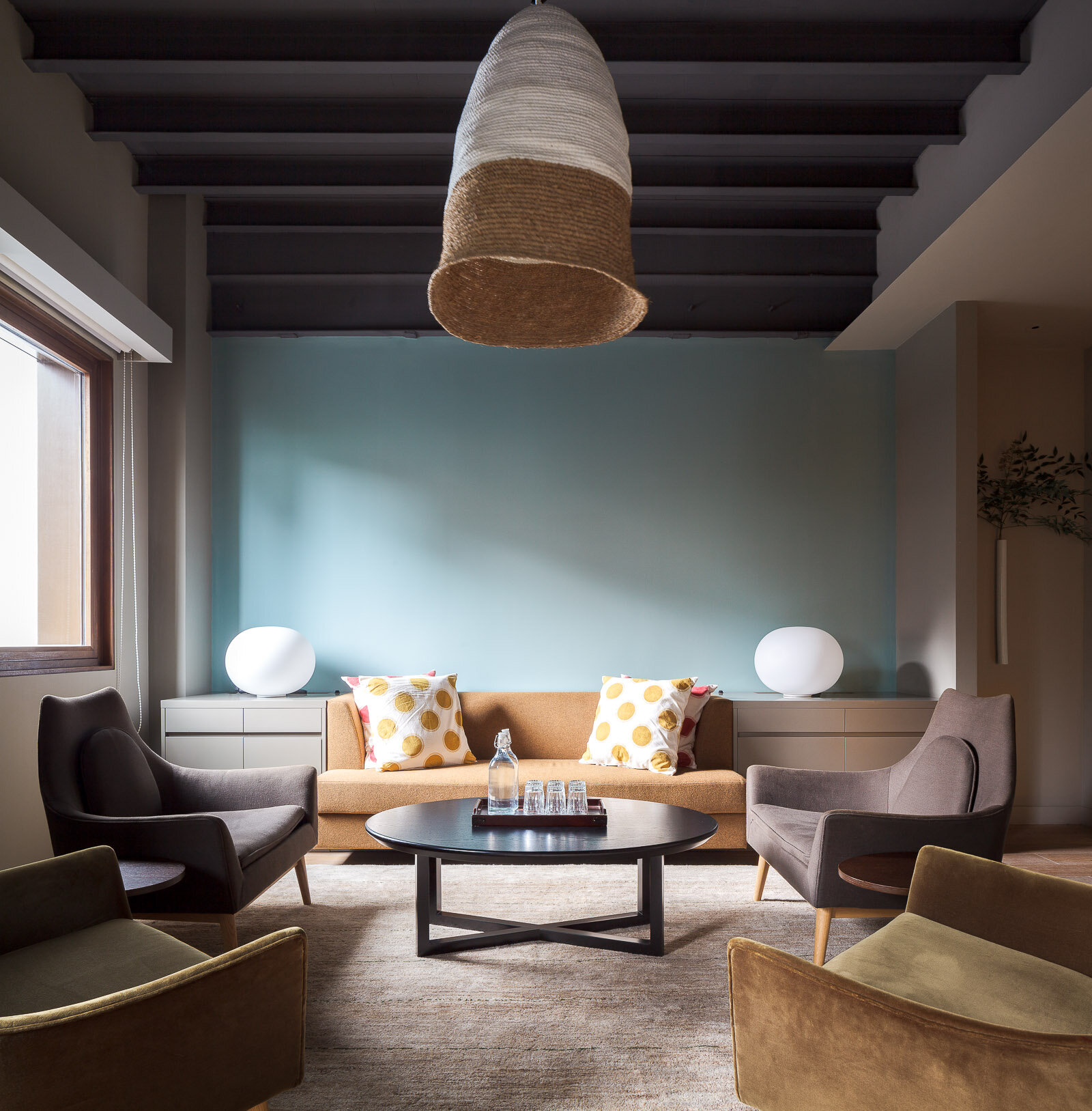
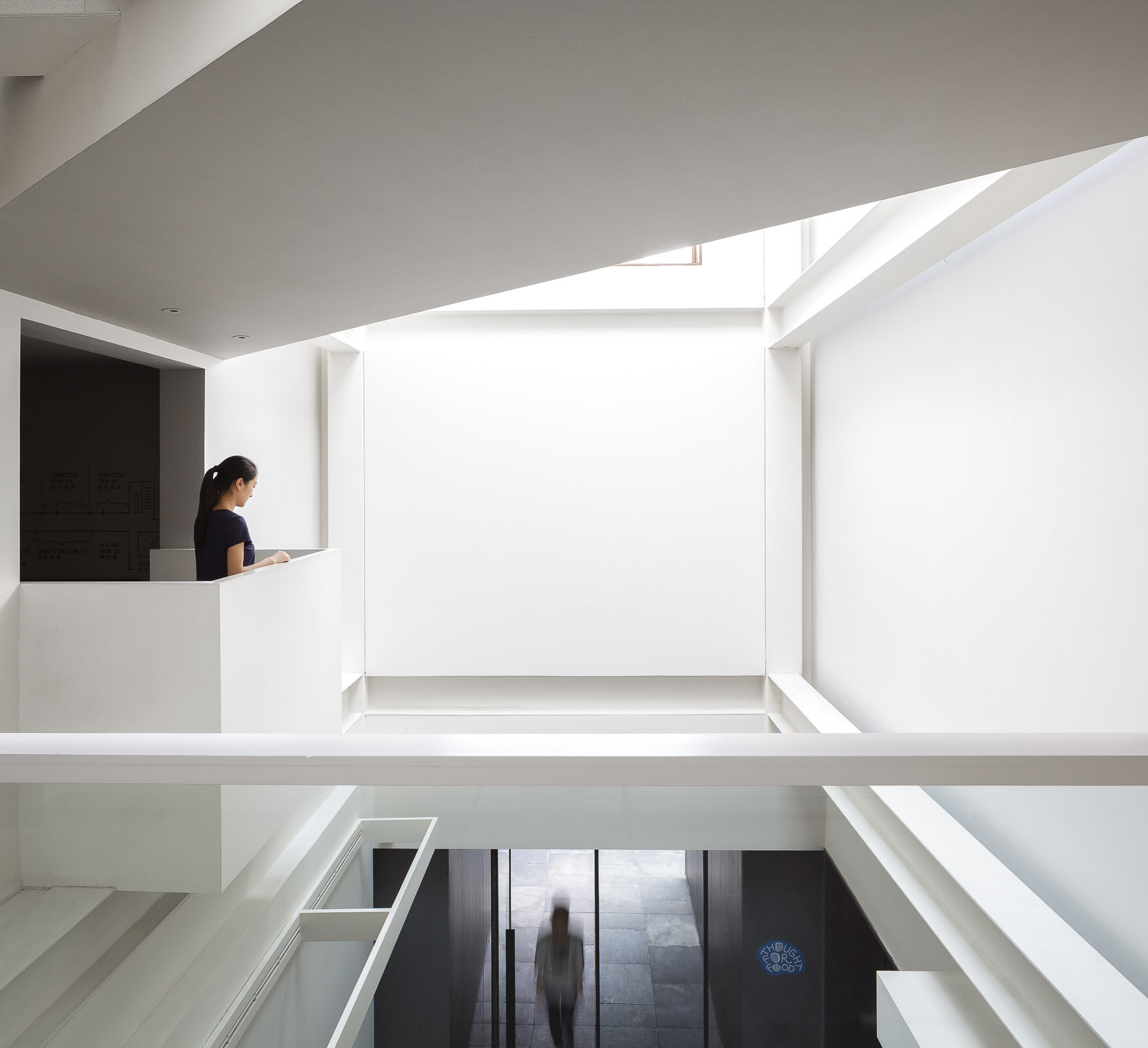
An adaptive reuse of a historical building in Shanghai China, The Living Room is built to create walkable, mixed-use alternatives to China’s rampant urbanization. The center is a hub for services including family therapy, art therapy, yoga, a health-oriented restaurant with food and beverage programs, and a small-scale urban farm.
The interior was designed by noted New York architect and designer Calvin Tsao of TsAO & McKOWN. Shanghai-based architecture firm, Neri & Hu, designed the exterior of the building.
From the venue: The Living Room by Octave is our flagship wellbeing center offering integrated and customized wellness programs delivered by a group of world-class practitioners. The exterior was designed by Neri & Hu and the interior was designed by noted architect and designer Calvin Tsao. It also houses a gourmet, organic, natural restaurant, Thought for Food, and a Children's Enhancement Center for kids ages 6 months to 3 years. Our facility is located on Jianguo Xi Lu in the heritage area of Shanghai, and is equipped with advanced air filtration which cleans up to 0.002 μm PM2.5. We also have running water reaching international quality standards.
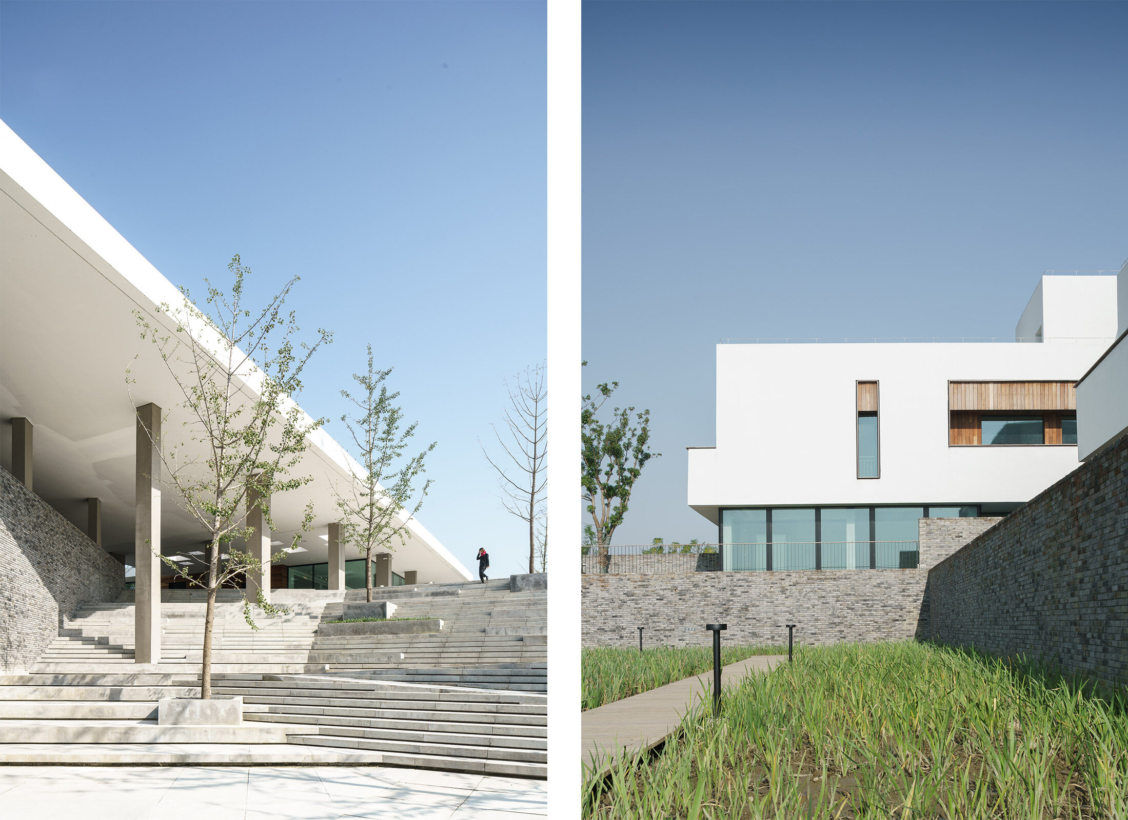
Sangha Retreat by Octave is a life learning and wellness community on the shores of beautiful Yangcheng Lake, Suzhou. Sangha seeks to re-establish the connection and unity between people and the inner self, others, and nature. One of the best and largest of wellness centers in China, it offers an eclectic selection of premium lifelong learning and wellness programs, ranging from wellness spa packages to fully-serviced hotels and lakeside villas, with custom medical evaluation and services, body training, early education and a gourmet restaurant as part of the experience.
With lifelong learning standing at the center of the idea, Sangha exults in the serendipity and quietude it enjoys as an ex-urban resort, while enjoys convenient transportation to nearby cities – 15 minutes’ drive to Suzhou, 1 hour or so to Shanghai. Here, within a surrealistically beautiful surrounding, take a retreat from fully-packed schedule and enjoy a moment of calm and intimacy. Meet like-minded friends at Sangha and embark on a journey of body, mind and spirit discovery and bonding.
The design of the resort was overseen by New York based design firm TsAO & McKOWN.
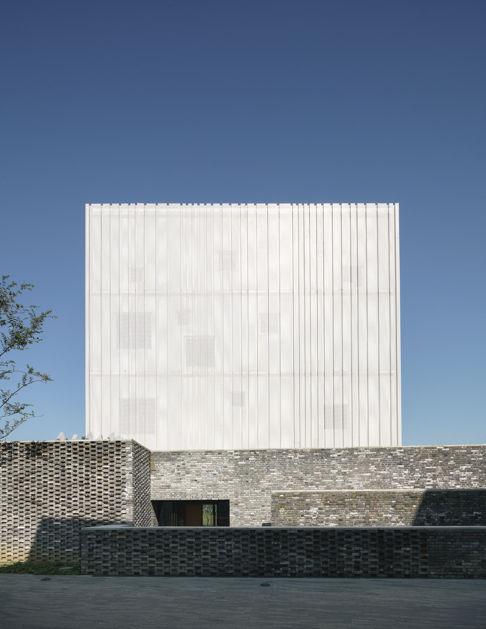
Church in Sangha.
Sangha Retreat by Octave is a life learning and wellness community on the shores of beautiful Yangcheng Lake, Suzhou. Sangha seeks to re-establish the connection and unity between people and the inner self, others, and nature. One of the best and largest of wellness centers in China, it offers an eclectic selection of premium lifelong learning and wellness programs, ranging from wellness spa packages to fully-serviced hotels and lakeside villas, with custom medical evaluation and services, body training, early education and a gourmet restaurant as part of the experience.
With lifelong learning standing at the center of the idea, Sangha exults in the serendipity and quietude it enjoys as an ex-urban resort, while enjoys convenient transportation to nearby cities – 15 minutes’ drive to Suzhou, 1 hour or so to Shanghai. Here, within a surrealistically beautiful surrounding, take a retreat from fully-packed schedule and enjoy a moment of calm and intimacy. Meet like-minded friends at Sangha and embark on a journey of body, mind and spirit discovery and bonding.
The design of the resort was overseen by New York based design firm TsAO & McKOWN.
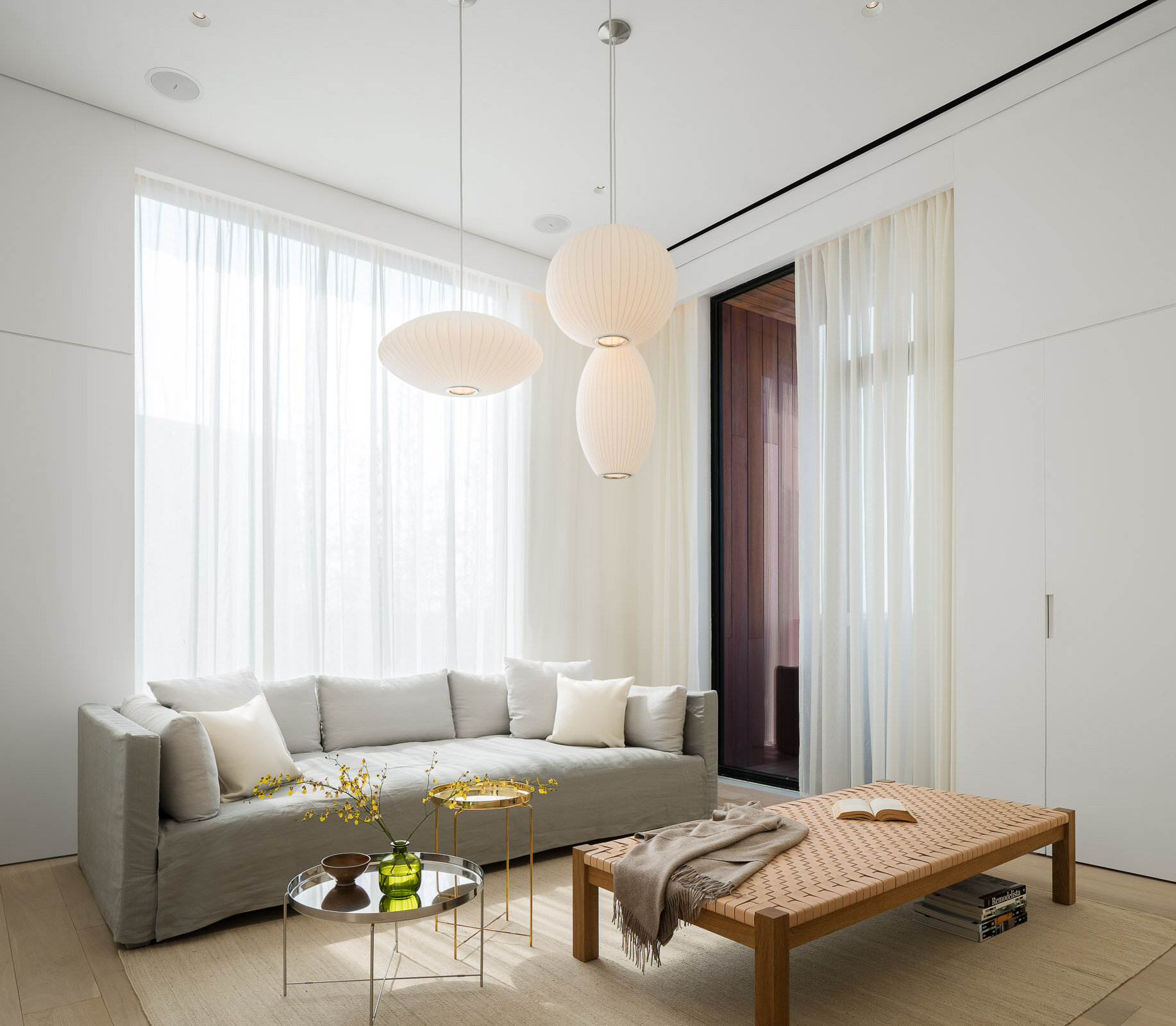
Sangha Retreat by Octave is a life learning and wellness community on the shores of beautiful Yangcheng Lake, Suzhou. Sangha seeks to re-establish the connection and unity between people and the inner self, others, and nature. One of the best and largest of wellness centers in China, it offers an eclectic selection of premium lifelong learning and wellness programs, ranging from wellness spa packages to fully-serviced hotels and lakeside villas, with custom medical evaluation and services, body training, early education and a gourmet restaurant as part of the experience.
With lifelong learning standing at the center of the idea, Sangha exults in the serendipity and quietude it enjoys as an ex-urban resort, while enjoys convenient transportation to nearby cities – 15 minutes’ drive to Suzhou, 1 hour or so to Shanghai. Here, within a surrealistically beautiful surrounding, take a retreat from fully-packed schedule and enjoy a moment of calm and intimacy. Meet like-minded friends at Sangha and embark on a journey of body, mind and spirit discovery and bonding.
The design of the resort was overseen by New York-based design firm TsAO & McKOWN. The interior of the villa was designed by Shanghai-based design practice Neri & Hu.
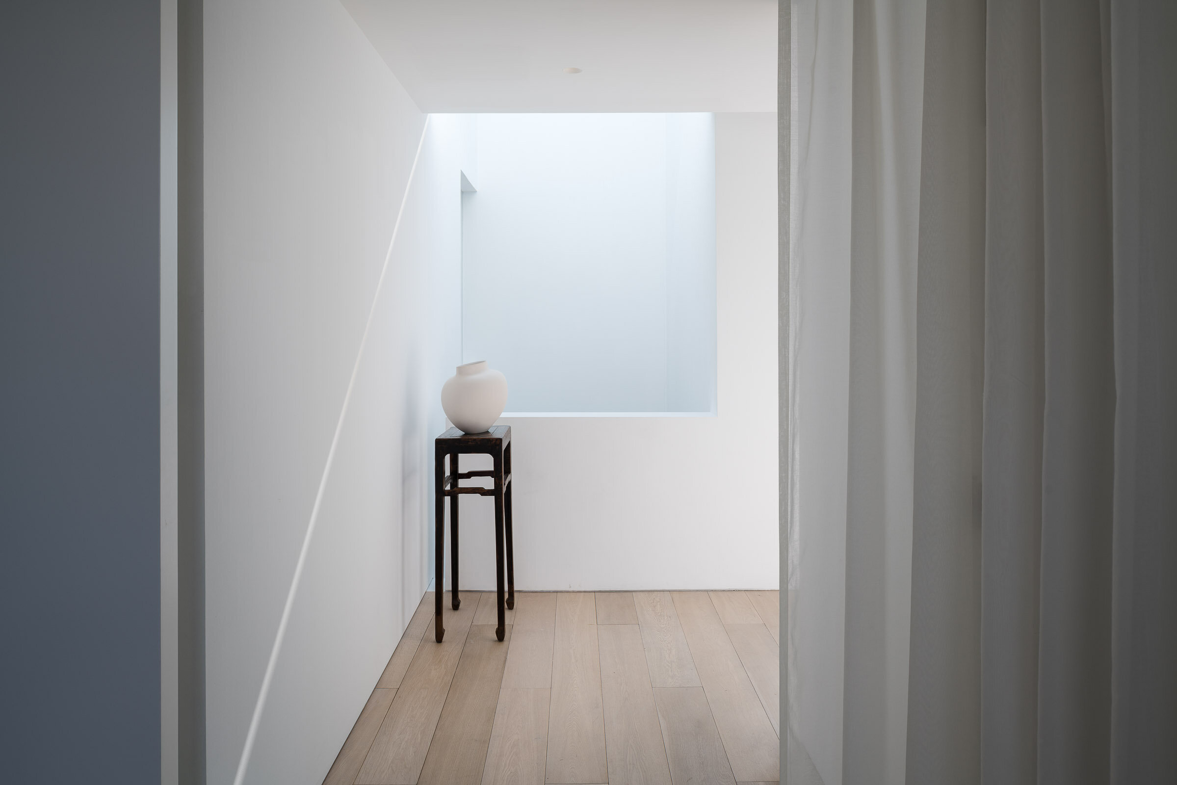


With its bold integration of architecture, structure, and environmental engineering, this solar-responsive, “breathing” building centers on sustainability and wellness.
Design informed by nature
The headquarters for Shenzhen Rural Commercial Bank, a 158-meter-tall, 33-story tower located on the edge of a public park in one of Shenzhen’s key business districts, responds to the region’s tropical climate through a series of biophilic and sustainable design solutions.
The design inspiration is drawn from natural systems and elements like water and wind. These influences are evident in features such as the multistory water wall at the building’s main lobby, the undulating striations of marble cladding the tower’s elevator core, and the integration of a mixed-mode natural ventilation system that allows for seasonal air flushing of the key common areas and office levels. Automated louvers in the vertical atria traversing the full height of the tower and mechanized window vents on each office floor comprise a flexible system that allows the building to “breathe” during the frequent periods of pleasant weather experienced in Shenzhen.
High performance through integrated design
Building on SOM’s tradition of innovative structural engineering solutions, the design incorporates a tightly-spaced diagrid that serves two primary purposes. The first is to provide a solar shading system for the building and its occupants, an important consideration in mitigating the region’s hot tropical sun. Solar gain is thereby reduced by approximately 34 percent, and the design dramatically reduces glare in the office spaces within. The second purpose is to create an entirely column free floor plan and enable maximum flexibility of office layouts. The resulting interior space is defined only by a simple perimeter glass wall with an automated solar control blind to maintain optimal daylight levels.
A glass and bronze-toned private banking pavilion adjacent to the tower’s main lobby incorporates a high performance double-skin wall to provide environmental comfort and visual privacy to the consultation suites and areas for the display of artwork within. Reflecting pools, grey granite paving and seating areas, and arrays of trees and ground cover define the main entrance spaces and small gardens at the base of the tower, relating to the adjacent large public park that is the centerpiece of the district master plan.
SOM’s work on the Shenzhen Rural Commercial Bank Headquarters included architecture, mechanical, electrical and plumbing, structural and civil engineering. The tower is targeting LEED Platinum and China Green Star certification.
The Tianjin CTF Finance Centre is located in the Tianjin Economic-Technological Development Area, an outer district of Tianjin, China. The tower serves as an anchor for the larger area development, while housing office space, luxury serviced apartments, and a hotel.
By stacking reducing floor plates, the tower tapers dramatically to minimize the surface area exposed to wind, sun, and moisture. The gently undulating curves of the façade subtly denote the integration of the three distinct programs within a singular smooth object. Square in plan with rounded corners, the floor plate geometry enables unique interior fit-outs and customization options for occupants. Research by the architect has the shown that lateral forces due to vortex shedding can be controlled by tapering the vertical profile of the tower and softening any sharp corners in plan. The building’s aerodynamic shape greatly reduces this vortex shedding by “confusing the wind” and disrupting the opportunity for any resonating wind forces and loads on the structure.
The softly curving glass skin integrates eight sloping megacolumns that follow a lyrical line connecting the centers and corners of all four elevations. These curving megacolumns increase the structure’s response to seismic concerns and are integral to both the gravity and lateral systems. They are effective in increasing the stiffness of the building’s perimeter frame, consequently attracting a larger portion of the seismic forces in compliance with the Chinese code requirements.
The façade reinforces the curvature of the tower form and creates a shimmering texture over the building’s surface. The crystalline-like curtain wall stretches from the suspended glass canopies at each of the lobbies to the dematerialized, megacolumn-looped crown and presents a bold expression of a comprehensive, integrated design on the Tianjin skyline.
Pazhou Poly is a mixed-use office and hospitality complex in Guangzhou, designed by Skidmore, Owings and Merrill. It was named a winner in the Best Tall Building 300-399 Meters category of the 2020 Award of Excellence by The Council on Tall Buildings and Urban Habitat (CTBUH).
The Architecture and Design Academy at Wenzhou Kean University (WKU) holds the center of a fast-growing campus, following a master plan by Michael Graves Architecture and Design. As a Chinese institution whose curriculum is provided by Kean University in the United States, the Academy offers students degrees in Architecture, Industrial Design, and Computer Science that are recognized in both the United States and China.
The design superimposes open plan design studios over a two-story base of flexible loft spaces that house class labs, library, maker spaces, and office suites. The base buildings form a pattern of lofts and alleys, clad in dark gray granite, contrasting with the white ultra-high-performance concrete of the upper structure. At the north and south, grand porches address major campus spaces, and frame entrances to the great central hall with its Piazza di Spagna-sized stadium seating- the largest shared venue for campus events.
Located in North Point, the eastern district of Hong Kong Island, 18 King Wah Road is a new 23-story office building in Hong Kong and second commission for Pelli Clarke Pelli Architects. 18 King Wah Road commands a striking view of Victoria Harbor and Kowloon Bay, and to the west, PCPA’s iconic International Financial Centre marks the skyline.
In contrast to the density of its urban neighbors, the design of PCPA’s building is airy and buoyant. The triple-height Y-shaped columns that support the base of the tower deliver an exciting visual on the street, announcing the building’s presence. While solid in breadth, they seem to lift the base effortlessly. Metal fins wrap around the crisp glass and steel curtain wall, creating a lively pattern the full height of the building’s compact vertical massing. Each office floor will have spectacular views of the waterfront, Victoria Harbor and Kowloon Bay.
The project meets Gold Well Building Standards, Platinum Asia Regional Intelligent Green Building, and LEED Platinum. Key environmental concerns such as dense urban congestion and extreme afternoon temperatures are addressed. The curved corners of the building allow air to flow continuously throughout the tightly built-up neighborhood. High-performance metal sunshades wrap the exterior of each floor to minimize the effect of the intense solar rays from overheating the interior spaces. The shades are designed to function specifically to the sun’s orientation. On the north-west corner, they extend outwards and downward to mitigate the harsh afternoon sun. On the south-west corner, a second shade extends out to block the higher angled mid-day sun. Concurrently, this second feature acts as a light-shelf that directs daylight deeper into office interiors, significantly reducing the need for artificial lighting.
Headquartered in New-York with 50 office locations around the world, WeWork has now transformed Shanghai buildings into exciting shared workspaces. As the flagship location for China, WeWork Weihai Road resides in a historical building originally designed by British firm Spence Robinson & Partners in the 1930s. The designer took inspiration from "The Grand Budapest Hotel" and added pink, blue and green into the original structure, combining lively modern design into the historical architecture. The historic building has now transformed into a modern workspace, attracting aspiring entrepreneurs, designers and emerging businesses large and small.
Headquartered in New-York with 50 office locations around the world, WeWork has now transformed Shanghai buildings into exciting shared workspaces. As the flagship location for China, WeWork Weihai Road resides in a historical building originally designed by British firm Spence Robinson & Partners in the 1930s. The designer took inspiration from "The Grand Budapest Hotel" and added pink, blue and green into the original structure, combining lively modern design into the historical architecture. The historic building has now transformed into a modern workspace, attracting aspiring entrepreneurs, designers and emerging businesses large and small.
Abbott Customer Experience Center (CEC) in Shanghai, designed by M Moser Associates, a global architecture and interior design firm who pioneered the integrated approach to deliver effective workplaces.
From M Moser:
The Abbott Customer Experience Center (CEC) will foster a customer focused show-suite and training center with state-of-the-art interactive technology. In lieu of a traditional reception desk, the lobby welcomes visitors with a two-story modular digital LED tile wall, surrounding speakers, a hanging art-sculpture with customer-engaging audio-visual hardware, and a cantilevered continuous staircase the spans the entire vertical stretch of the building. We designed in a 50-person auditorium, executive business center, an exterior roof terrace, garden, staff workplace, call center, and fully functioning biosafety training labs.
Achieving a rating of LEED Silver, this facility represents the company’s commitment to sustainability, wellness, and a human-centered purpose to healthcare science.
Founded on the belief that all design should deliver a human connection with space, we begin our process with a deep-dive exploration of what emotional reactions would align with core business objectives. If the desired effect is comfort, excitement, playful, cheerful, confidence, boldness, intimacy, or even an uncomfortable awkwardness, this informs specific properties of scale, materiality, colors, spatial adjacencies, lighting and furniture selections.
The Abbott CEC is designed with the human experience in mind first — driving the technology integration, user interface, materials, and the interior architecture.
During the 6-month design period, a carefully constructed customer journey was mapped out through working intimately with Abbott and consultants to gain a deep understanding of their business. The journey outlined the experiences and interface for the users (customers) at each “touch point”. This then informed the architectural design of the space.
The 6 x 8 x 2.4h meter “Möbius strip” or “Infinite Ribbon” sculpture was created as an iconic arrival point for customers in the lobby, to inspire curiosity and push information about Abbott. The structure is completely hung from the ceiling and cantilevered from the core wall. Guests can walk inside and thru motion sensors, the LED display screens and background audio immediately come alive. Videos are played on screens on both sides. Gesture-based menu interaction is also available for a more customized experience.
The stair is at the heart of connectivity between floor functions and the vertical journey experience. Guests walk up the stair with an obscure view up thru “floating” landings to the fourth floor. New slab openings, structural bracing, and each stair run and landing is fully cantilevered from the building core, with only 1 larger support at the base. The first 3 steps of the stair were created as landings to hide this support.
The Customer Experience Center begins on the second floor. The “Hall of Challenges” disrupts guests perception of space through a long corridor with light in motion, reflection, intense sound effects, and digital images on screen beyond. This experience was designed to disconnect customers from their previous surroundings and into a fully immersive new space which begged for their attention.
The other rooms of the Experience Center include a curved floor-to-ceiling rear projection screen, dramatic surround sound, 48-point ‘Multitaction’ touch screen, ceiling light effects, a virtual environment with rear projection on all four walls of the room (where any environment could be presented), product demo area, and an interactive customer solution room.
Kokaistudios' newest projects with Four Seasons Hotels & Resorts - the Dai Forni Italian located in the newly built Four Seasons Kuwait in the Burj Alshaya building.
Having previously worked together on the Brasserie at the Four Seasons Kyoto the Four Seasons team invited Kokaistudios to conceive an elegant F&B destination bringing the freshness and tastes of Italy to Kuwait.
The starting point of the design process was to canvas Italy and determine which part of its vast culinary heritage and geography to focus on and the designers quickly settled upon the tastes, smells and textures of the Mediterranean and in particular the island of Sicily; long the meeting point between the cultures of the Middle East and Europe. Dai Forni is part of the emerging global cultural culinary trend of regional rather than national cuisines; and the restaurant design and cuisine are a testament to this trend.
Kokaistudios envisioned the space as an oasis for all of the senses with the entrance characterized by an immense green wall; itself an innovative structure filled with local desert plant varietals; and large fire pillars that frame the entrance experience and bring the guests along a sandstone floored corridor into main dining areas centered by an expansive antipasti counter covered in a pink hued hand treated cooper from Italy.
To the left of the entrance corridor sits the front dining area featuring a stunning 12 meter high space with expansive views onto the city and the Persian Gulf beyond. The designers have enrobed the space in a custom designed metal mesh curtain illuminated by a diffused lighting system that creates a soft shimmering glow. The intense sunlight and temperatures during the day-time drove the creation of an elaborate system of laser cut curtains that help to maintain a cool and welcoming temperature.
Kokaistudios' newest projects with Four Seasons Hotels & Resorts - the Sintoho Asian fine dining restaurant located on the top floor of the newly built Four Seasons Kuwait in the Burj Alshaya building.
Having previously worked together on the Brasserie at the Four Seasons Kyoto the Four Seasons team invited Kokaistudios to conceive an innovative F&B destination that could elevate the street foods of the cities of Singapore, Tokyo and Hong Kong into a fine dining destination and experience.
Intrigued by the concept and the location in a city with no established tradition of Asian fine dining we set about creating a temple to Asian cuisine and craftsmanship that eschewed kitschy and thematic styles and aimed for the creation of an essential and refreshing space in which the dining experience is influenced both by the architecture of the space and the food offering.
The restaurant design was conceived first and foremost around the idea of celebrating the diversity and excellence of Asian cuisine and creating spaces and opportunities for the guests to experience the sights, smells and tastes of these food cultures up close.
We searched for commonalities between the cultures in order to come up with a design language to unite them and we took our inspiration less from the current nature of the individual countries but rather from the historical role that Chinese culture has played over time throughout Asia and how those influences continue to be part of everyday life.
The entrance area of the restaurant features a long corridor flanked on one side by an expansive green wall filled primarily with local desert plant varietals and on the other by a series of custom designed water towers which combine to create a cooling and soothing experience. The corridor finishes in a tea wall fronted by an elaborate carved wood tea station where guests can select an expansive choice of fine teas.
To the right of the entrance corridor sits the main open dining area on the right that features expansive 12 meter high ceilings that offers expansive views of the city and the Persian Gulf beyond. The front dining area center features a series of custom designed furniture for which we cooperated with Kyoto based artisans and the area is hemmed by an extensive shousugi ban burnt wood sushi counter inlaid with hand hammered brass. The soft lighting in the area comes from the series of water drop glass pendants produced by the London based artisans DHLiberty Lux.
The rest of the public area seating is centered largely around the individual open live cooking stations where guests can experience up-close the preparation of robatta, teppanyaki, and dim sum and other delicacies from Hong Kong which have been clad by hand-hammered metal hoods and sculpted stone bases featuring images and motifs typical inspired by classical designs found in China.
The strong inter-play between the main materials of wood, stone, and hand-finished metals is thrown a curve by the insertion of a 3D feature wall made of exposed concrete forms that runs the length of the kitchen wall and has been designed using parametric principles and its undulating form appears as a dynamic wave while being in actuality a straight structure.
The private dining rooms are an ode to Chinese embroidery craftsmanship with bespoke chairs and walls featuring hand-printed linen fabric albeit with a wink to principal designer Filippo Gabbiani’s home town of Venice via the use of the Fortuny silk pendant lamps and red Murano glass inlays.
The bathrooms are an experience in and of themselves as we cooperated with a Shanghai based video production team Flatmind to create a series of Chinese shadow video installations that are projected on the grey hand hammered Chinese stone.
The outdoor seating areas that are shared with the neighboring Italian restaurant Dai Forni; also designed by Kokaistudios; feature a stunning glass sculpture from London based artisans Duffy.
The design of this project is a new step in Kokaistudios method of combining a strong architectural approach to the design of interiors with an original use of materials and light to create unexpected subtle emphatic feeling between the space and the people; handcrafted materials shaped and controlled up to the finest detail interact and interplay with the both the day and night light and reveal an incredibly expressive power.
Brasserie Restaurant & Lounge at Four Seasons Hotel Kyoto, designed by Kokaistudios.
The new Four Seasons hotel is located in the UNESCO protected area of the temples of Kyoto at the base of the mountains and faces a historical traditional Japanese pond surrounded by a magnificent heritage ikeniwa. Positioned between the arrival lobby and the garden, the restaurant is the core of the public space of the hotel. The architect conceived the space on with a strong architectural strategy by using the Kyoto traditional system to connect indoor to outdoor, creating a large architectural feature that frames the view of the garden.
Originally built in the 1930s by French real estate company Foncière et Immobilière de Chine, the Jian Ye Li “shikumen” complex; located in the heart of the former French concession had evolved and been altered over the years but was essentially intact in its historical configuration and represented an incredible development opportunity.
Originally these “shikumen” buildings were designed for middle class families in Shanghai and as they lacked modern plumbing facilities they were often seen as products with little value to preserve and were either demolished or just the “shell” was maintained and they were converted it into commercial use.
After extensive research and study, Kokaistudios developed an architectural renovation strategy that maintained the architectural features of the “shikumen” lane houses while tastefully altering the internal layout and transforming them into spaces suitable for modern luxurious living where each original lane house unit was transformed into one luxurious guest suite.
Practicality is not a term that applies to this project as the shikumen architectural typology; characterized by their narrow and tall nature meaning that the minimum 110 sq.m suites are split over 2 floors via a step staircase with no elevator; does not lend itself naturally to conversion to hospitality use. However when the ultra-luxury Capella hotel brand entered into the project several years later minimal upgrades to the architecture of the buildings were required to meet their exacting standards and they created 55 luxury suites each occupying one of the lane-houses.
Today the hotel occupies a unique position within Shanghai’s luxury hotel landscape and offer their guests a truly unique hospitality experience not available anywhere else in the world.
Originally built in the 1930s by French real estate company Foncière et Immobilière de Chine, the Jian Ye Li “shikumen” complex; located in the heart of the former French concession had evolved and been altered over the years but was essentially intact in its historical configuration and represented an incredible development opportunity.
Originally these “shikumen” buildings were designed for middle class families in Shanghai and as they lacked modern plumbing facilities they were often seen as products with little value to preserve and were either demolished or just the “shell” was maintained and they were converted it into commercial use. After extensive research and study, Kokaistudios developed an architectural renovation strategy that maintained the architectural features of the “shikumen” lane houses while tastefully altering the internal layout and transforming them into spaces suitable for modern luxurious living where each original lane house unit was transformed into one luxurious guest suite.
Practicality is not a term that applies to this project as the shikumen architectural typology; characterized by their narrow and tall nature meaning that the minimum 110 sq.m suites are split over 2 floors via a step staircase with no elevator; does not lend itself naturally to conversion to hospitality use. However when the ultra-luxury Capella hotel brand entered into the project several years later minimal upgrades to the architecture of the buildings were required to meet their exacting standards and they created 55 luxury suites each occupying one of the lane-houses.
Today the hotel occupies a unique position within Shanghai’s luxury hotel landscape and offer their guests a truly unique hospitality experience not available anywhere else in the world.
The new store is part of a series of openings across China, and is indicative of the city’s rise as a shopping destination, and one as forward in offerings as fellow first-tier cities Shanghai, Beijing and Guangzhou. Situated at The MixC shopping mall in the city’s Nanshan district, the store occupies a compact unit featuring an interior design by Stockholm-based architect and longtime collaborator Christian Halleröd. A hydraulic crane trolley lifting a colourful light box signals the store’s presence. Walls, flooring and ceiling in a soft grey hue form the backdrop for an assortment of furnishings, including large glass and steel cabinets, similar low cabinets with an orange frame, chunky wooden sofas with blue-striped upholstery, and a large oval table dipped in a striking purple hue. One side of the store is lined with large mirrors and pink stools. Lighting is highly functional, and sees three rows of tubular lights across the ceiling. The new Byredo store carries the brand’s full range of perfumes, home fragrances and hand & body care products.
The new store is part of a series of openings across China, and is indicative of the city’s rise as a shopping destination, and one as forward in offerings as fellow first-tier cities Shanghai, Beijing and Guangzhou. Situated at The MixC shopping mall in the city’s Nanshan district, the store occupies a compact unit featuring an interior design by Stockholm-based architect and longtime collaborator Christian Halleröd. A hydraulic crane trolley lifting a colourful light box signals the store’s presence. Walls, flooring and ceiling in a soft grey hue form the backdrop for an assortment of furnishings, including large glass and steel cabinets, similar low cabinets with an orange frame, chunky wooden sofas with blue-striped upholstery, and a large oval table dipped in a striking purple hue. One side of the store is lined with large mirrors and pink stools. Lighting is highly functional, and sees three rows of tubular lights across the ceiling. The new Byredo store carries the brand’s full range of perfumes, home fragrances and hand & body care products.
An adaptive reuse of a historical building in Shanghai China, The Living Room is built to create walkable, mixed-use alternatives to China’s rampant urbanization. The center is a hub for services including family therapy, art therapy, yoga, a health-oriented restaurant with food and beverage programs, and a small-scale urban farm.
The interior was designed by noted New York architect and designer Calvin Tsao of TsAO & McKOWN. Shanghai-based architecture firm, Neri & Hu, designed the exterior of the building.
From the venue: The Living Room by Octave is our flagship wellbeing center offering integrated and customized wellness programs delivered by a group of world-class practitioners. The exterior was designed by Neri & Hu and the interior was designed by noted architect and designer Calvin Tsao. It also houses a gourmet, organic, natural restaurant, Thought for Food, and a Children's Enhancement Center for kids ages 6 months to 3 years. Our facility is located on Jianguo Xi Lu in the heritage area of Shanghai, and is equipped with advanced air filtration which cleans up to 0.002 μm PM2.5. We also have running water reaching international quality standards.
Sangha Retreat by Octave is a life learning and wellness community on the shores of beautiful Yangcheng Lake, Suzhou. Sangha seeks to re-establish the connection and unity between people and the inner self, others, and nature. One of the best and largest of wellness centers in China, it offers an eclectic selection of premium lifelong learning and wellness programs, ranging from wellness spa packages to fully-serviced hotels and lakeside villas, with custom medical evaluation and services, body training, early education and a gourmet restaurant as part of the experience.
With lifelong learning standing at the center of the idea, Sangha exults in the serendipity and quietude it enjoys as an ex-urban resort, while enjoys convenient transportation to nearby cities – 15 minutes’ drive to Suzhou, 1 hour or so to Shanghai. Here, within a surrealistically beautiful surrounding, take a retreat from fully-packed schedule and enjoy a moment of calm and intimacy. Meet like-minded friends at Sangha and embark on a journey of body, mind and spirit discovery and bonding.
The design of the resort was overseen by New York based design firm TsAO & McKOWN.
Church in Sangha.
Sangha Retreat by Octave is a life learning and wellness community on the shores of beautiful Yangcheng Lake, Suzhou. Sangha seeks to re-establish the connection and unity between people and the inner self, others, and nature. One of the best and largest of wellness centers in China, it offers an eclectic selection of premium lifelong learning and wellness programs, ranging from wellness spa packages to fully-serviced hotels and lakeside villas, with custom medical evaluation and services, body training, early education and a gourmet restaurant as part of the experience.
With lifelong learning standing at the center of the idea, Sangha exults in the serendipity and quietude it enjoys as an ex-urban resort, while enjoys convenient transportation to nearby cities – 15 minutes’ drive to Suzhou, 1 hour or so to Shanghai. Here, within a surrealistically beautiful surrounding, take a retreat from fully-packed schedule and enjoy a moment of calm and intimacy. Meet like-minded friends at Sangha and embark on a journey of body, mind and spirit discovery and bonding.
The design of the resort was overseen by New York based design firm TsAO & McKOWN.
Sangha Retreat by Octave is a life learning and wellness community on the shores of beautiful Yangcheng Lake, Suzhou. Sangha seeks to re-establish the connection and unity between people and the inner self, others, and nature. One of the best and largest of wellness centers in China, it offers an eclectic selection of premium lifelong learning and wellness programs, ranging from wellness spa packages to fully-serviced hotels and lakeside villas, with custom medical evaluation and services, body training, early education and a gourmet restaurant as part of the experience.
With lifelong learning standing at the center of the idea, Sangha exults in the serendipity and quietude it enjoys as an ex-urban resort, while enjoys convenient transportation to nearby cities – 15 minutes’ drive to Suzhou, 1 hour or so to Shanghai. Here, within a surrealistically beautiful surrounding, take a retreat from fully-packed schedule and enjoy a moment of calm and intimacy. Meet like-minded friends at Sangha and embark on a journey of body, mind and spirit discovery and bonding.
The design of the resort was overseen by New York-based design firm TsAO & McKOWN. The interior of the villa was designed by Shanghai-based design practice Neri & Hu.
