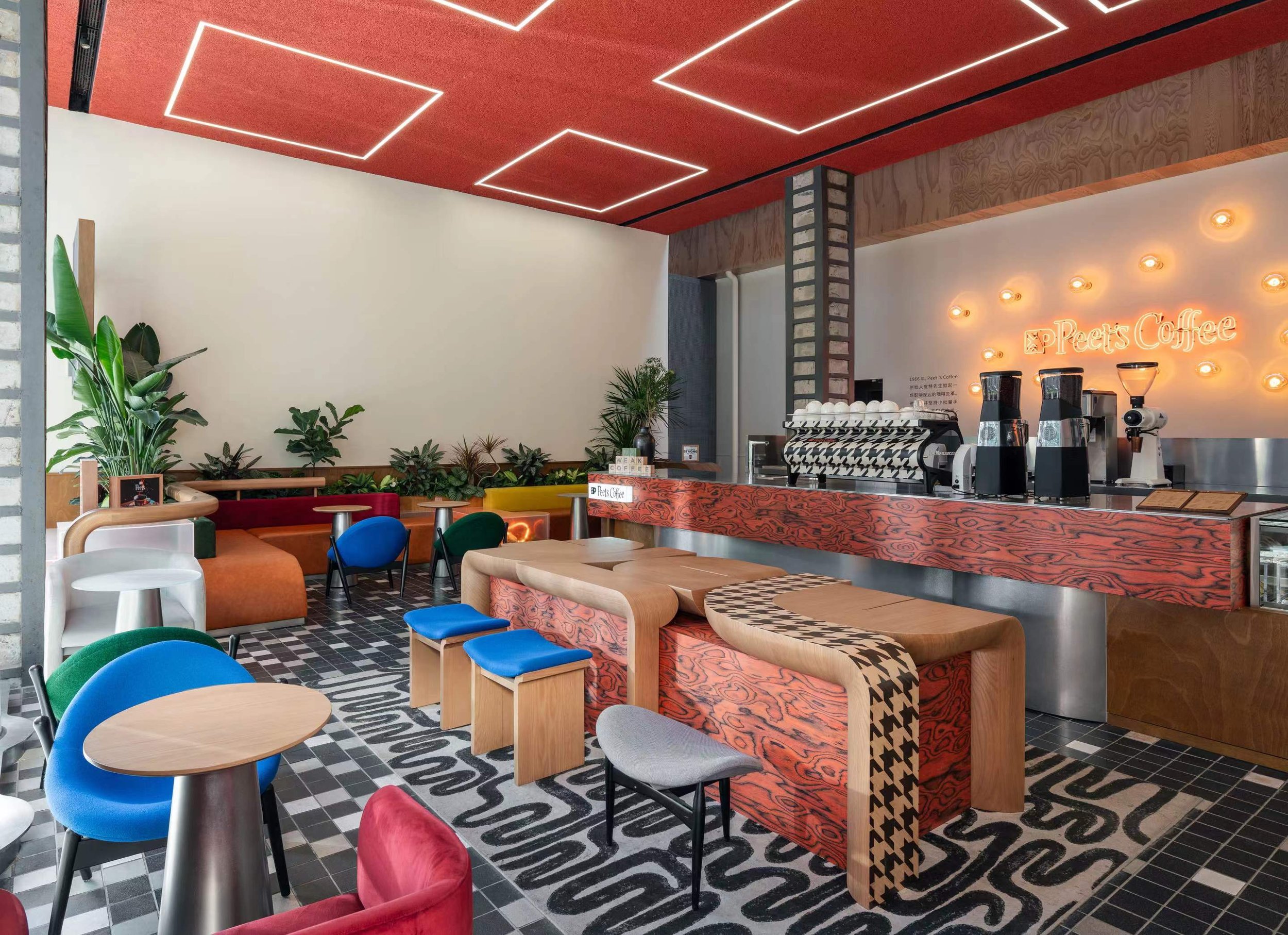
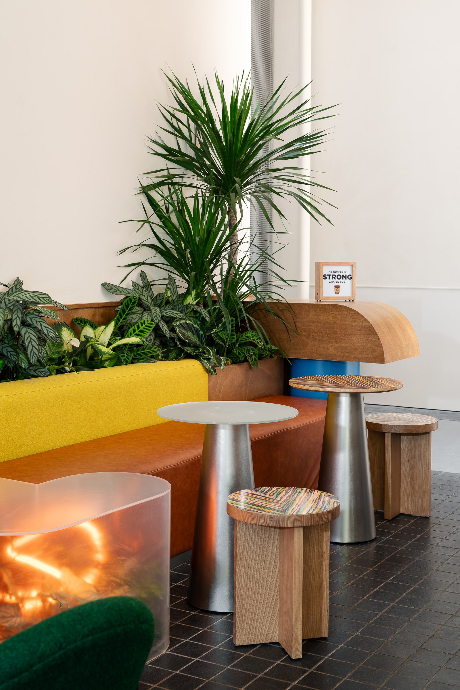
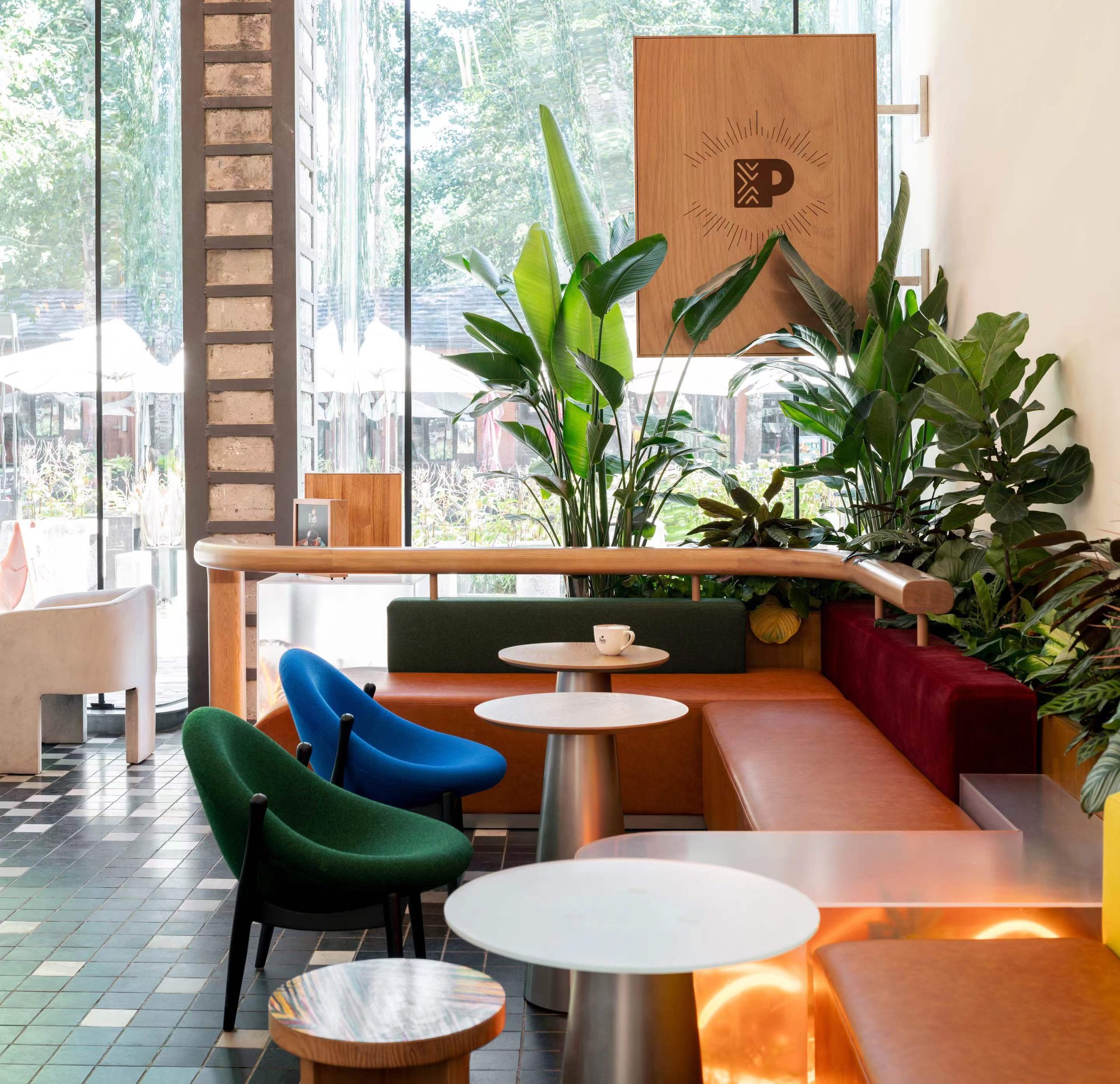
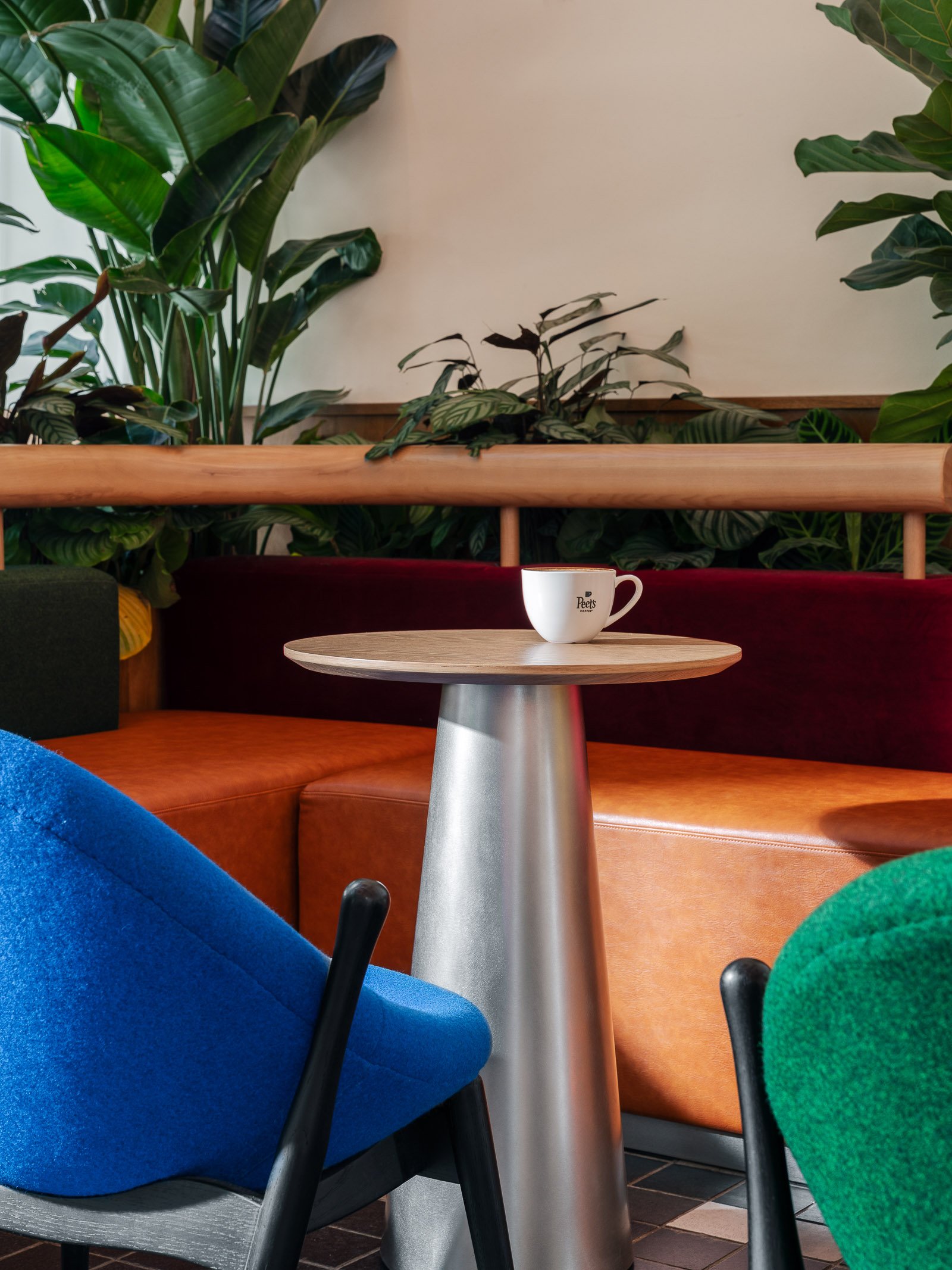
The main materials used throughout Peet’s Coffee stores - warm timber finishes, white painted walls, plants which embody the Peet’s Californian origins - are present within the UCCA space, ensuring that the store remains consistent with the brand identity established in China.
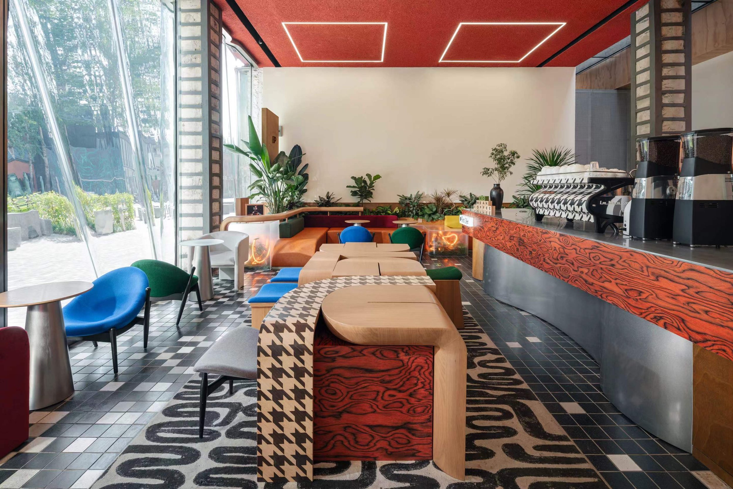
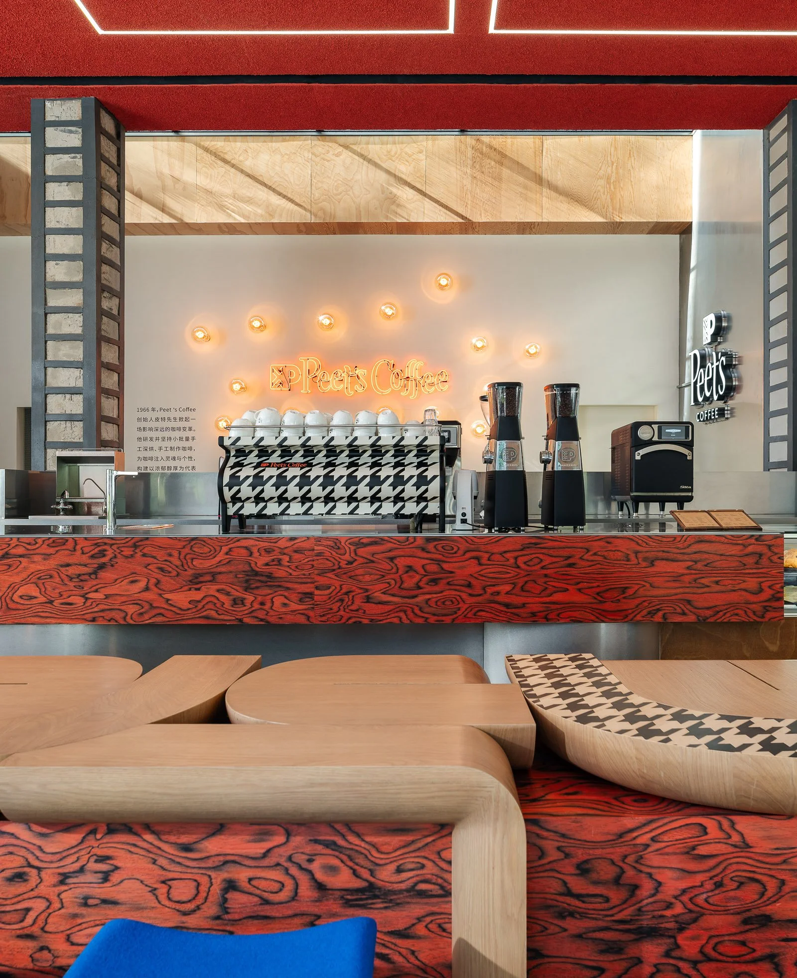
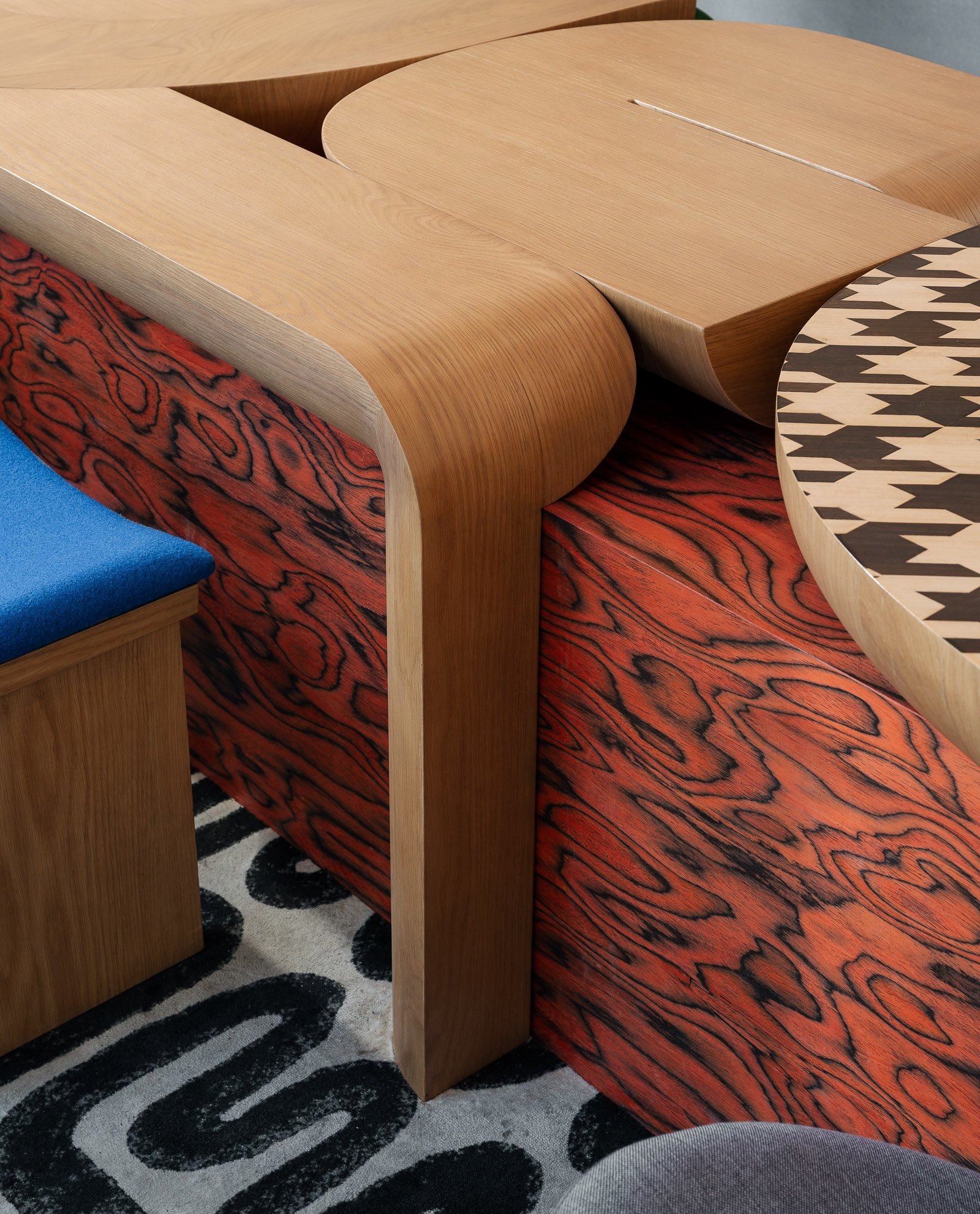
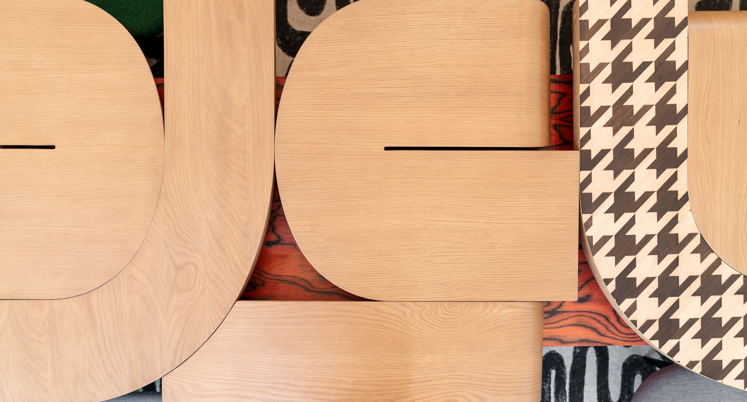
Layered on top of this neutral palette are bolder materials chosen specifically for this location. Stained red wood veneer connects to the architectural colour palette. Monochrome geometric shapes are used in furniture, rugs and as a graphic wrap for the coffee machine, creating a layering of pattern. Curving stainless steel wraps the counter front, reflecting light and colour around the space and mirroring the shape of the glass facade.
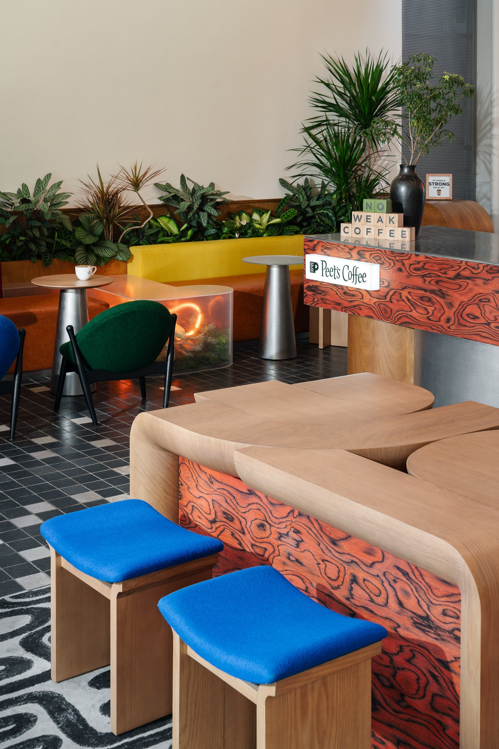
The concept of the ‘artist’s warehouse’ informs the key design elements in the space. A large central table comprised of an abstract arrangement of curved geometric forms (loosely inspired by the UCCA logo) creates an iconic first impression.
Matzform furniture in playful forms is upholstered in bright yellow and electric blue, adding a pop of colour.
