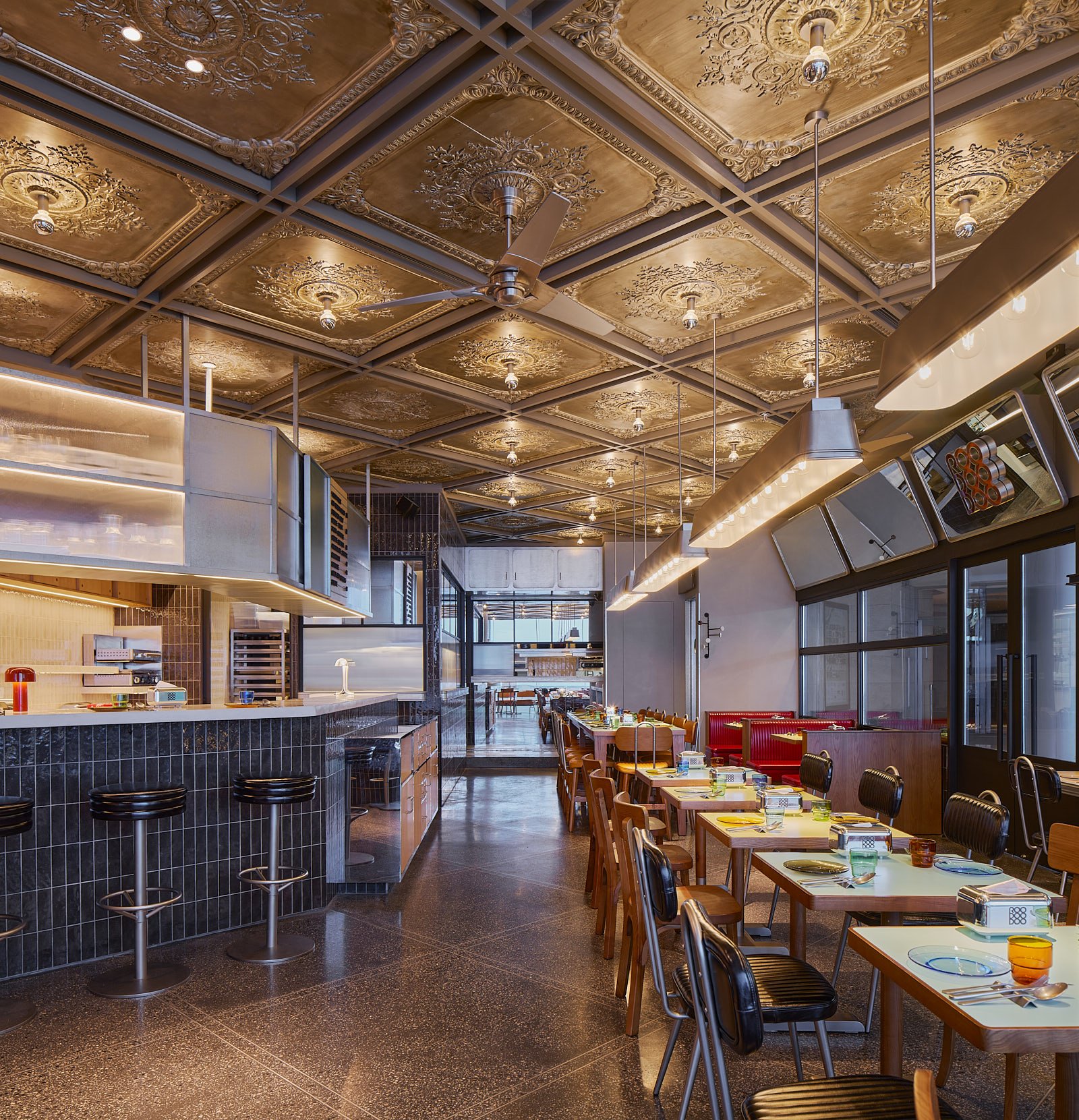
hcreates worked in conjunction with the legendary three Michelin-starred chef Paul Pairet and his team to create the latest concept in IFC, Roodoodoo. Located in the heart of Shanghai financial district, this building is a central focal point in Lujiazui for businesspeople, shoppers and tourists alike. The concept is a true all-day experience that transitions from breakfast to evening and bringing together dishes from Paul Pairet’s iconic restaurants Polux, Charbon, Mr & Mrs Bund whilst introducing many new instant classics including their first full bakery.
“When it comes to defining the interiors for Roodoodoo’s we call it Retro Sleek – inspired by the 1950’s American diners, industrial detailing and mid-century design. A focus on creating a minimal, sophisticated, and sleek design that is an “all-day-everyday” gathering place.” Says Design Director Hannah Churchill
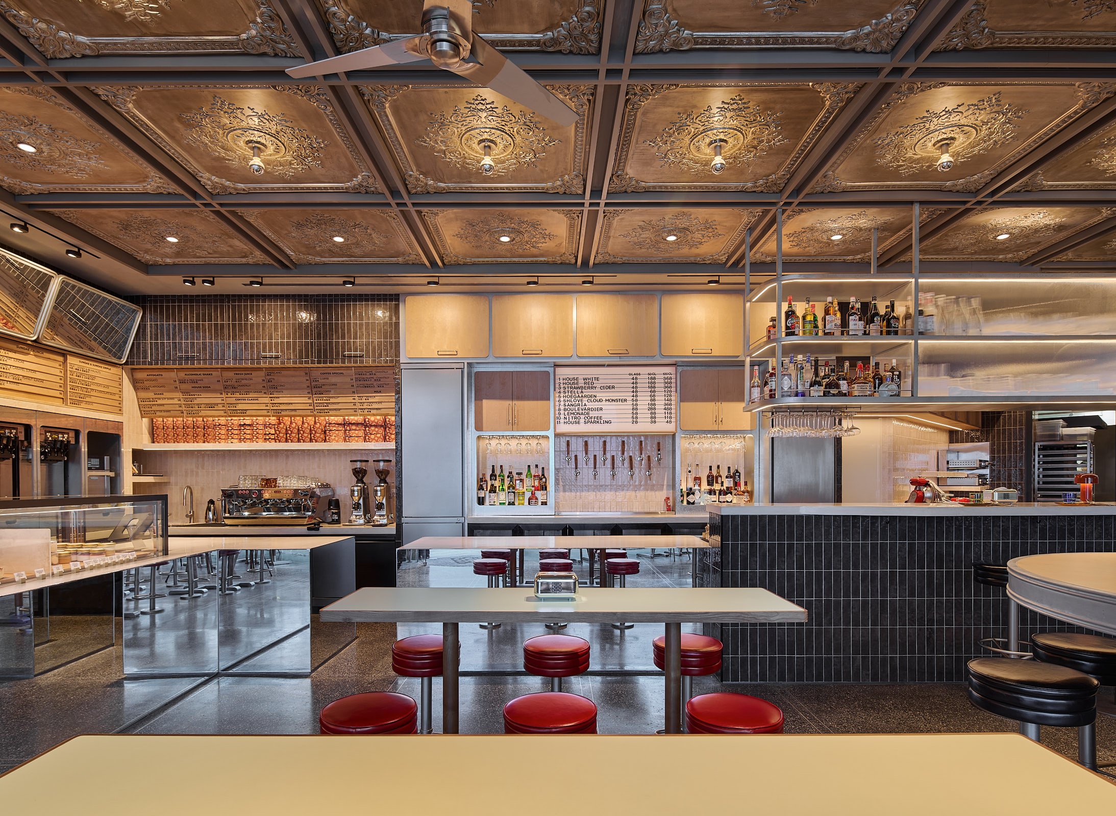
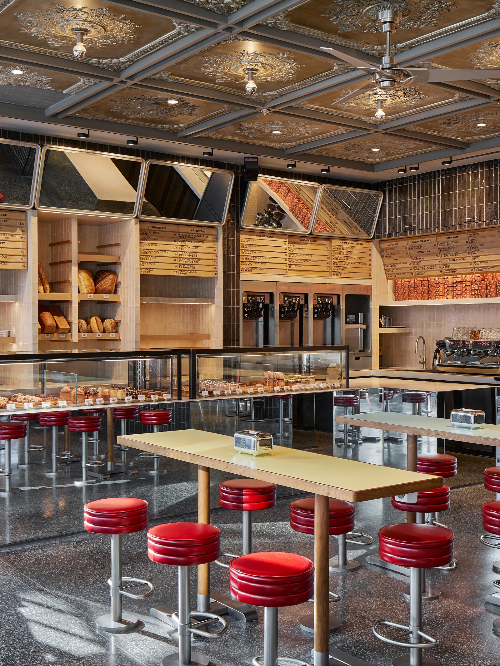
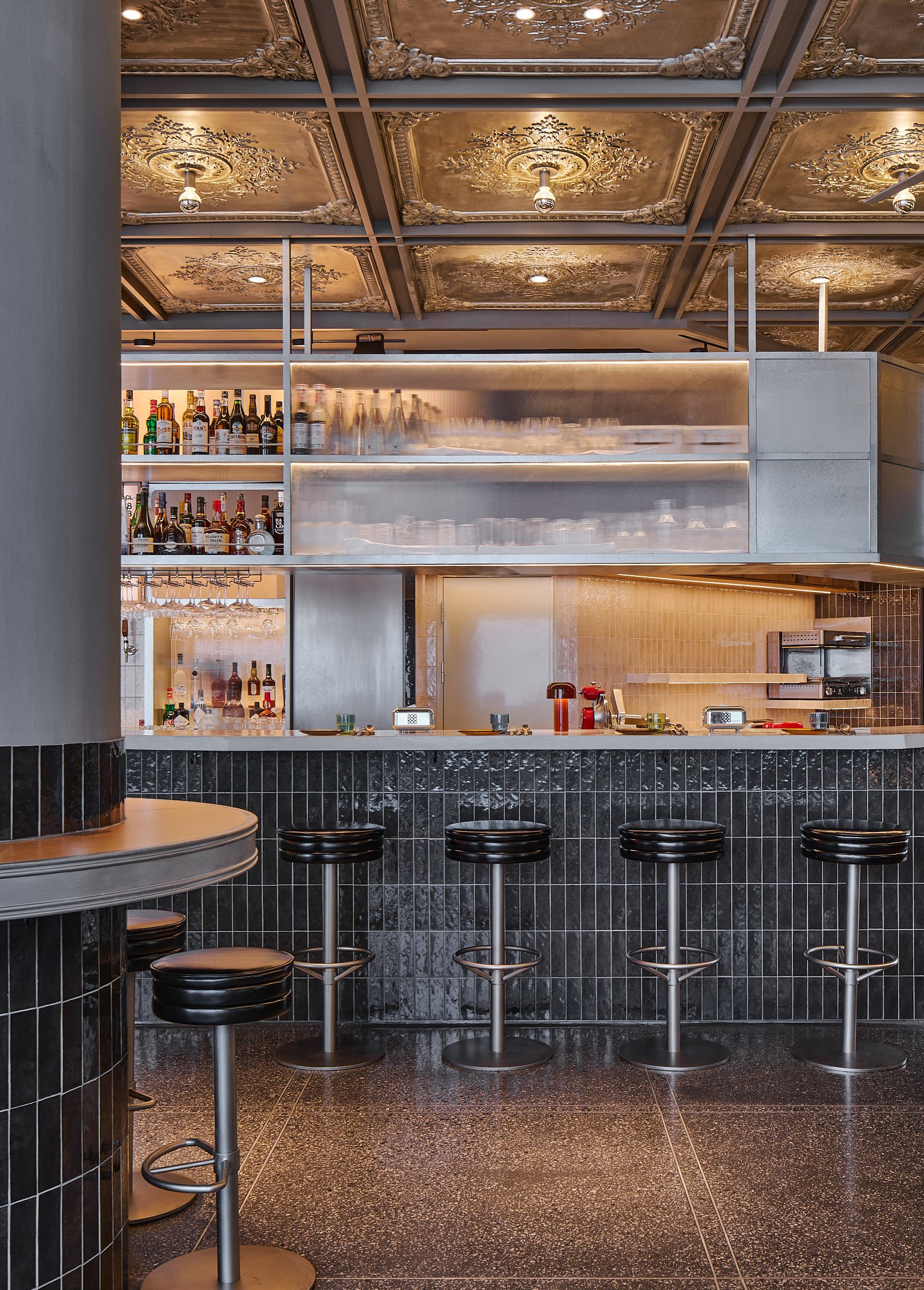
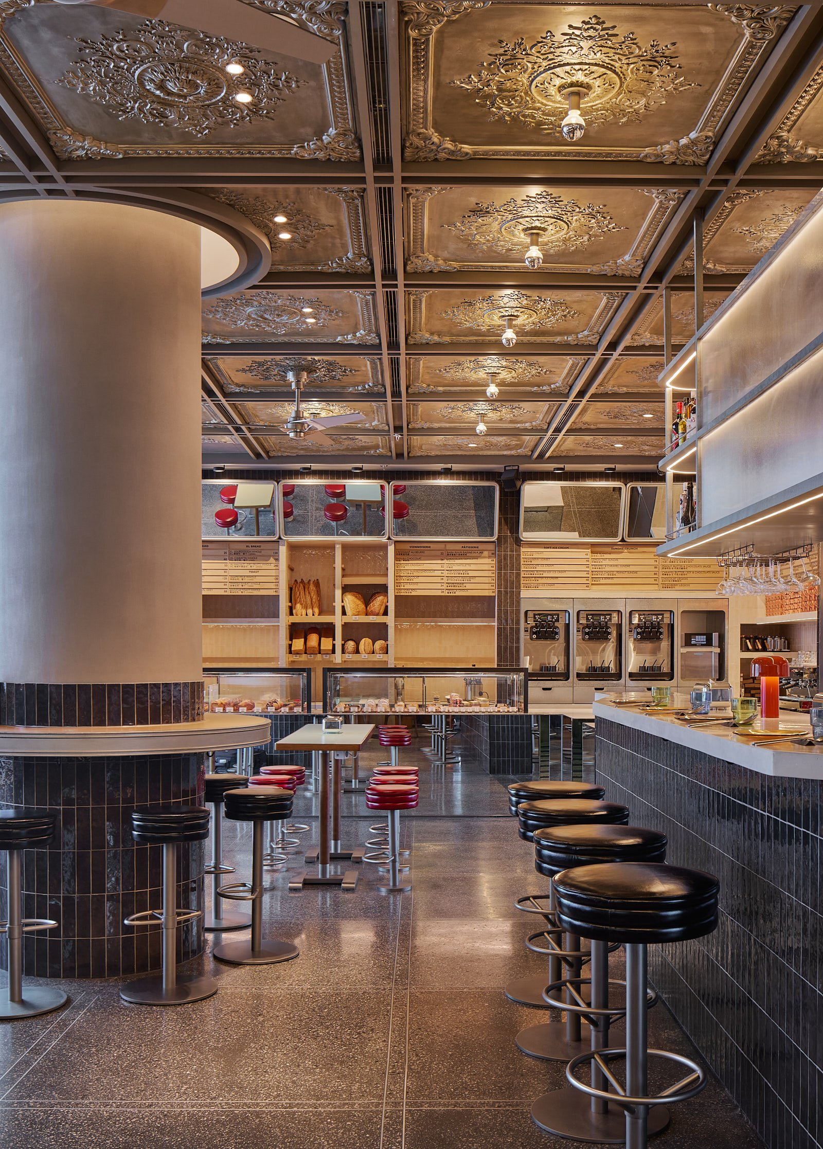
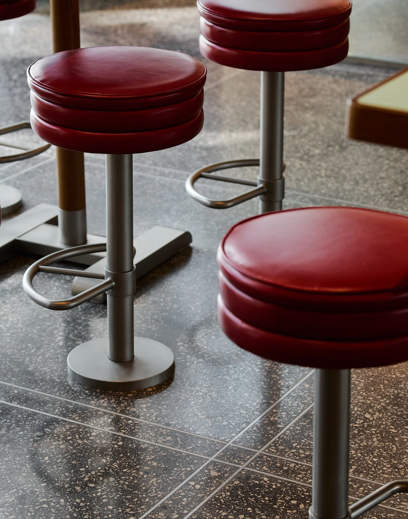
The distinctive style of the classic American diner is lent from railway lunch carts during the golden era of rail travel; hence it carries the functional, industrial and mechanical design in its genes. One of the main materials we were keen to explore was in the project is the use of galvanized steel, to form shelving, lighting, and furniture detailing which is often set against a grey /black neutral background. Located amongst the skyscrapers of Lujiazui, we took reference from the sleek reflective materiality of the urban environment through, reflective surfaces, concrete counter tops, metallic color ceiling, and rectilinear geometric forms throughout space.
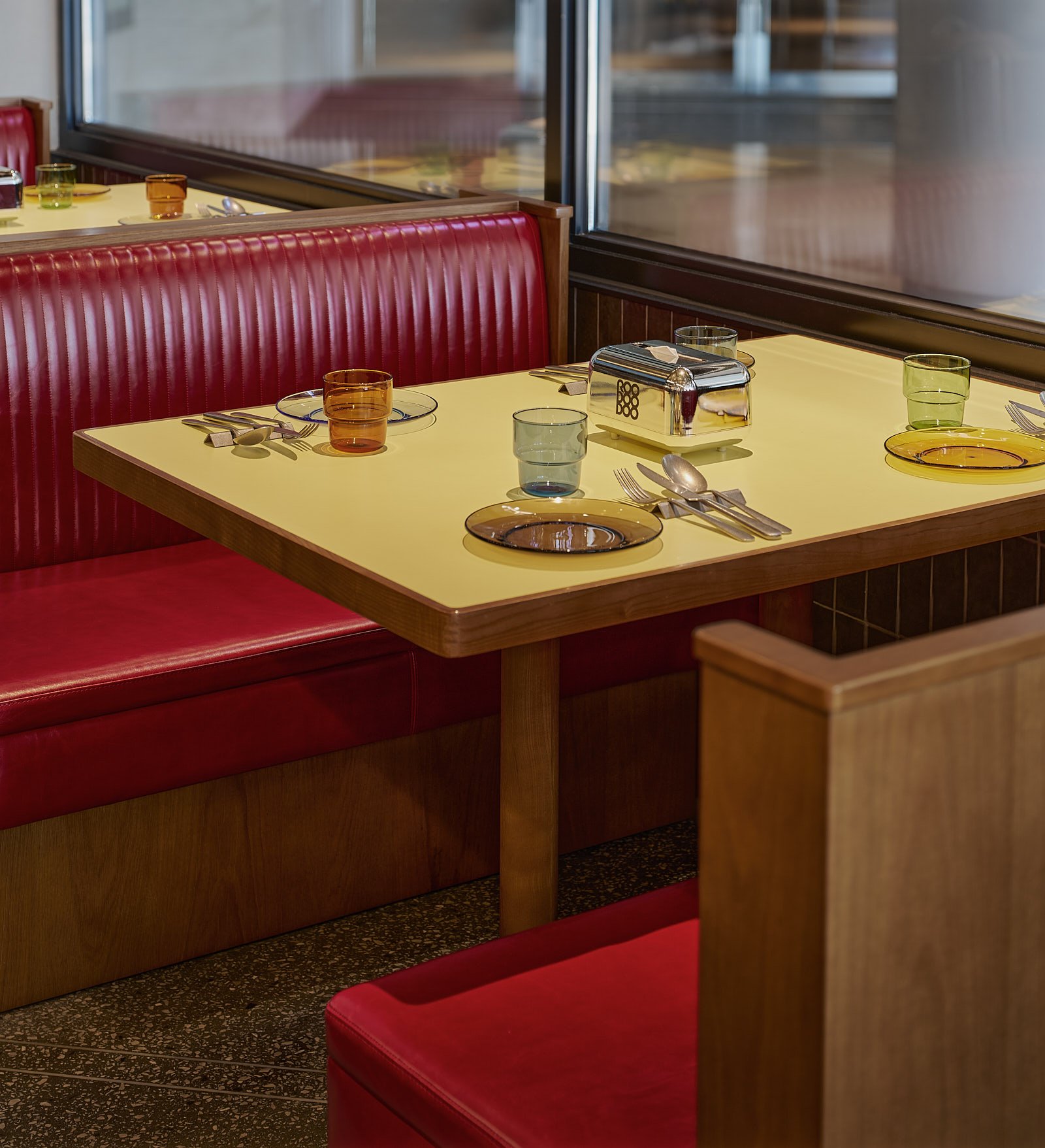
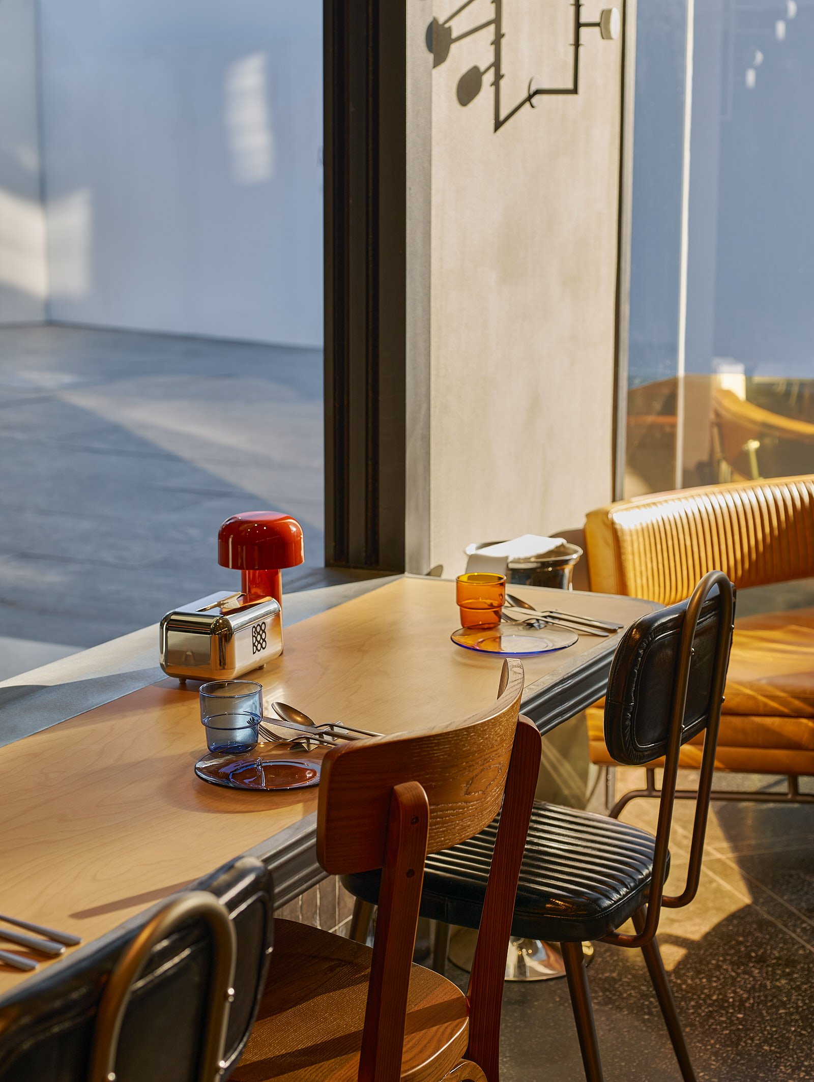
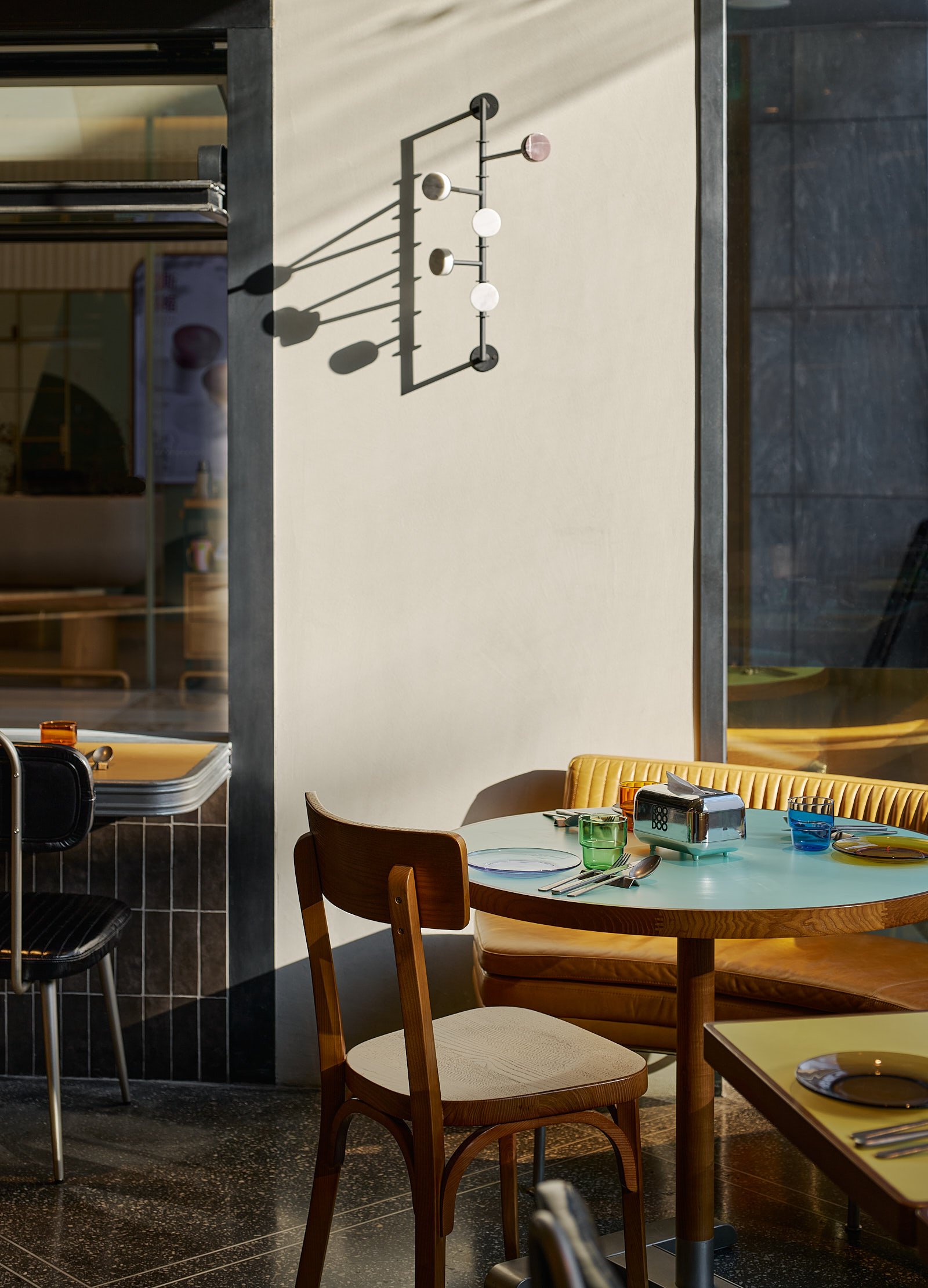
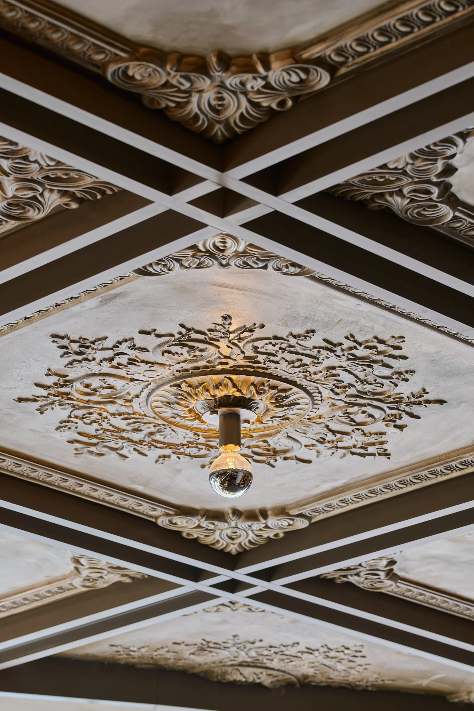
Central to the design was retaining a sense of warmth and comfort. Paying homage to the origins of the French menu, we used more signature French interior design elements, such as Roodoodoo’s instantly recognizable motif ceiling and black and cream ceramic tiles. Retro cues start to reveal itself through the soft pastel colour, warm timbers, rounded corners of cabinet doors and a mix of furniture types bringing an inviting, eclectic touch.
We wanted the space to borrow from old and new to create a warm and familiar space where the menu can be continually explored, and conversations can be enjoyed in comfort throughout the day.
